Thursday, July 12, 2012

CEO Confidence Surveys 2Q 2012 – Notable Excerpts


On July 5, The Conference Board released its 2nd Quarter CEO Confidence Survey.   The overall measure of CEO Confidence was at 47, down from 63 in the first quarter.

Notable excerpts from this July 5 Press Release include:
CEOs’ assessment of current economic conditions has turned considerably negative. Only 17 percent claim conditions have improved compared to six months ago, down significantly from 67 percent last quarter. A more negative attitude was also expressed regarding their appraisal of their own industries. Now, just 22 percent of business leaders say conditions have improved, compared with 42 percent in the first quarter of this year.
also:
Regarding profit expectations over the next 12 months, 64 percent of CEOs expect increases.
The Business Roundtable also recently released their CEO Economic Outlook Survey for the 2nd Quarter of 2012.   Notable excerpts from the June 20 release, titled “America's CEOs Soften Expectations on U.S. Economy” include the following:
The Business Roundtable CEO Economic Outlook Survey Index – a composite index of CEO expectations for the next six months of sales, capital spending and employment – trended downward to 89.1 in the second quarter of 2012, from 96.9 in the first quarter of 2012.
also:
“CEOs envision somewhat slower overall economic growth for 2012 and have modestly lower expectations for sales, capital expenditures, and hiring as compared to last quarter,” said Jim McNerney, Chairman of Business Roundtable and Chairman, President and CEO of The Boeing Company.  “While CEOs see continued economic expansion, the dip in quarterly sentiment reflects concern over increasingly persistent obstacles to a stronger recovery, including uncertainty over year-end U.S. Government tax and spending plans and a path to resolution of the Eurozone crises.”
also:
In terms of the overall U.S. economy, Business Roundtable members estimate real GDP will grow by 2.1 percent in 2012, down slightly from last quarter’s estimate of 2.3 percent.
_____

I post various economic forecasts because I believe they should be carefully monitored.  However, as those familiar with this blog are aware, I do not necessarily agree with many of the consensus estimates and much of the commentary in these forecast surveys.
_____

The Special Note summarizes my overall thoughts about our economic situation

SPX at 1334.76 as this post is written

The July 2012 Wall Street Journal Economic Forecast Survey


The July Wall Street Journal Economic Forecast Survey was published on July 11, 2012.  The headline is “Forecasters Say Fed Will Do More to Stir Economy.”

I found various excerpts to be notable, including the following:
"The Fed is now behind on both goals of its dual objective," said Allen Sinai of Decision Economics, who noted that the current unemployment rate of 8.2% is well above the central bank's perceived goal of around 6%, while annual inflation of around 1.5% is below the 2% target.
also:
They also say there is a 21% chance of recession in the next 12 months.
also:
Though there is disagreement over Fed policy, most economists give the U.S. central bank relatively high marks compared with its international peers. On a scale of 0-100, with 65 considered a passing grade, the Fed scored an average of 73, with just 25% of economists giving it a failing grade and 53% giving it As or Bs.
Furthermore, as seen in the Q&A section (in the spreadsheet), there was this question: "Is the risk to your 2012 growth forecast more to the upside or downside?" to which 91% indicated "downside" and 9% "upside."


The current average forecasts among economists polled include the following:

GDP:
full-year 2012:  2.0%
full-year 2013:  2.5%
full-year 2014:  2.9%

Unemployment Rate:
December 2012: 8.0%
December 2013: 7.6%
December 2014:  7.0%

10-Year Treasury Yield:
December 2012: 1.96%
December 2013: 2.69%
December 2014:  3.37%

CPI:
December 2012:  1.8%
December 2013:  2.2%
December 2014:  2.4%

Crude Oil  ($ per bbl):
for 12/31/2012: $88.37
for 12/31/2013: $91.56

(note: I highlight this WSJ Economic Forecast survey each month; commentary on past surveys can be found under the “Economic Forecasts” label)

_____

I post various economic forecasts because I believe they should be carefully monitored.  However, as those familiar with this blog are aware, I do not necessarily agree with many of the consensus estimates and much of the commentary in these forecast surveys.
_____

The Special Note summarizes my overall thoughts about our economic situation

SPX at 1341.45 as this post is written

Wednesday, July 11, 2012

Building Financial Danger – July 11, 2012 Update


On October 17, 2011 I wrote a post titled “Danger Signs In The Stock Market, Financial System And Economy.”  This post is a brief 14th update to that post.

My overall analysis indicates a continuing elevated and growing level of danger which contains  many worldwide and U.S.-specific “stresses” of a very complex nature.

I have written numerous posts in this blog of some of what I consider both ongoing and recent “negative developments.”  These developments, as well as other highly problematic conditions, have presented a highly perilous economic environment that endangers the overall financial system.

My analysis continues to indicate that there are many reasons for tremendous concern, as seen in almost innumerable fundamental economic, financial-market, and proprietary measures.

Many prominent parties seem to be fixated on the European financial problems.  While I continue to believe that these European problems are gravely serious and disconcertingly intractable, and have broader implications,  my analyses indicate that various exceedingly problematical U.S. economic conditions also continue to exist and many lack recognition or effective remedy.

Predicting the timing and extent of a stock market crash is always difficult, and the immense complexity of today’s economic situation makes such a prediction even more challenging. With that being said, my analyses indicate that the danger inherent in the financial system has reached a level at which a stock market crash – that would also involve (as seen in 2008) various other markets as well – continues to be at a level at which a near-term crash is of tremendous concern.

(note: the “next crash” has outsized significance and implications, as discussed in the post of January 6, "The Next Crash And Its Significance")

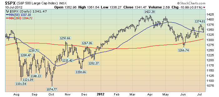
As reference, below is a one-year daily chart of the S&P500, indicating both the 50dma and 200dma as well as price labels.  The current price is 1341.47:

(click on chart to enlarge image)(chart courtesy of StockCharts.com; chart creation and annotation by the author)

_____

The Special Note summarizes my overall thoughts about our economic situation

SPX at 1341.47 as this post is written

Financial Stocks – July 11, 2012 Update Concerning Poor “Price Action”


On June 29, 2011 I wrote a blog post titled “Financial Stocks – Notable Price Action.”

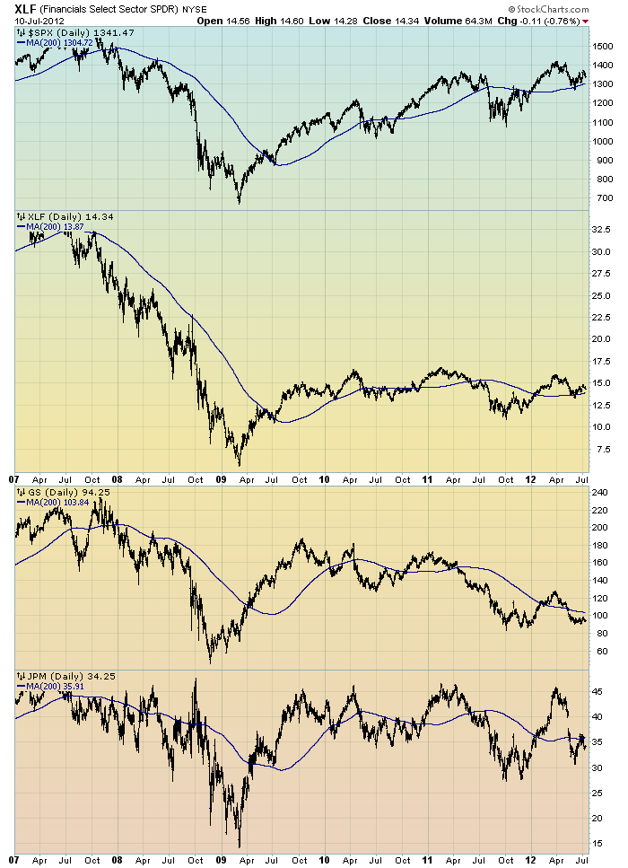
Although financial stocks have increased in price in 2012, I continue to believe that the longer-term “price action” of various financial stocks is disconcerting.  I view the poor performance of these financial and brokerage stocks to be one indicator among (very) many that serves as a “red flag” as to the financial markets and economy as a whole.

Here is an updated chart to that shown in the aforementioned June 29, 2011 post.  It shows the XLF (the financial ETF) on a daily basis since 2007.  As well, the S&P500 is plotted above it, with GS and JPM shown below it.  The blue line on each indicates the 200dma:

(click on chart image to enlarge)(chart courtesy of StockCharts.com; chart created by and annotated by author)


_____

The Special Note summarizes my overall thoughts about our economic situation

SPX at 1341.47 as this post is written

Tuesday, July 10, 2012

Financial Stocks – Relative Price To Overall Stock Market – July 10, 2012 Update


In the June 29, 2011 post (“Financial Stocks – Notable Price Action”) I wrote the following:
I think that the relatively poor “price action” of various financial stocks is notable.  It is one of many current indications that overall stock market health is not as strong as a casual glance at the major indices would indicate.
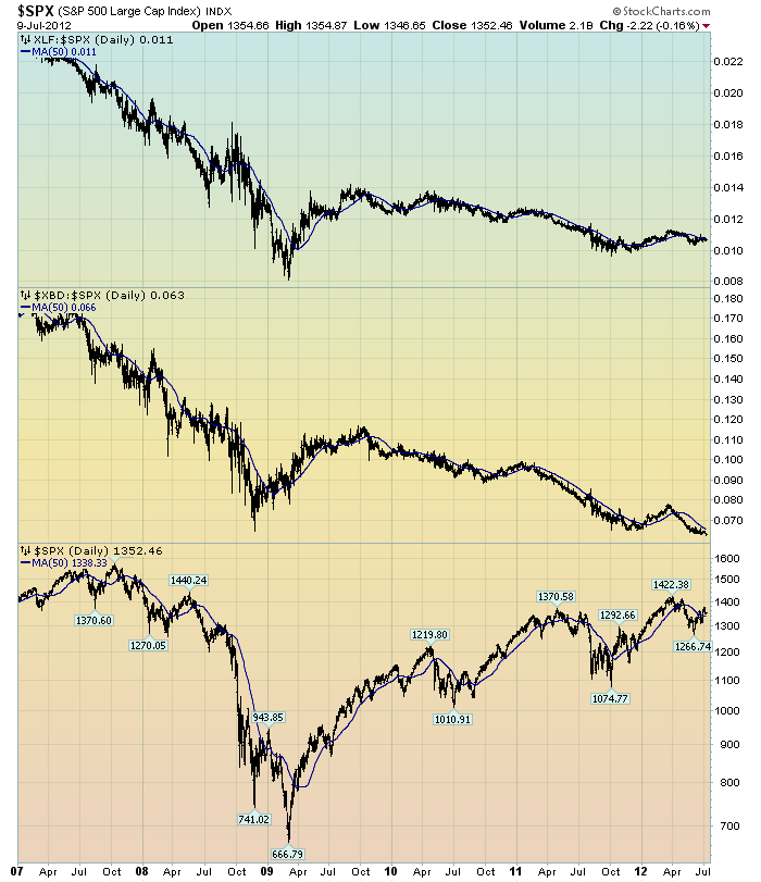
I continue to believe that the lagging / “sagging” price of various financial stocks is highly notable.  Here is a chart that I created a while ago that provides another view of the poor “price action” of the financial stocks vs. that of the entire stock market, as depicted by the S&P500:

(click on chart to enlarge image)(chart courtesy of StockCharts.com; chart created by and annotated by author)


-

The above chart is depicted on a daily basis, LOG scale, since 2007.   On each of the three plots, a blue line depicts the 50dma for perspective.

As one can see, there has been an interesting progression of the relative price of the XLF (Financial SPDR) vs. the S&P500, as seen in the top of the chart.  In the middle of the chart, the same can be seen in the $XBD (Broker/Dealer Index).  Generally, since mid-2009, the price of both the XLF and $XBD have been on a slow downward trajectory relative to the price of the S&P500.  The S&P500 is plotted on the bottom of the chart.

In my experience, any time the financials lag the general stock market for a considerable period, it is generally a “red flag” that should be closely monitored.
_____

The Special Note summarizes my overall thoughts about our economic situation

SPX at 1352.46 as this post is written

Sunday, July 8, 2012

Long-Term Charts Of The ECRI WLI & ECRI WLI, Gr. – July 6, 2012 Update


As I stated in my July 12, 2010 post ("ECRI WLI Growth History"):
For a variety of reasons, I am not as enamored with ECRI’s WLI and WLI Growth measures as many are.
However, I do think the measures are important and deserve close monitoring and scrutiny.
The movement of the ECRI WLI and WLI, Gr. is particularly notable at this time, as ECRI publicly announced on September 30, 2011 that the U.S. was “tipping into recession,” and ECRI has reaffirmed that view since, including a notable statement on March 15 (“Why Our Recession Call Stands”) as well as various interviews and statements the week of May 6, including:


Wall Street Journal video, May 9: “Free Market Economies Have Business Cycles


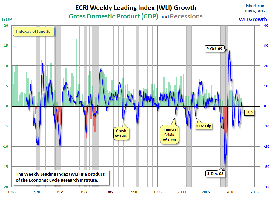
Below are three long-term charts, from Doug Short’s blog post of July 6 titled “ECRI Recession Call: Weekly Leading Index Again Improves.”  These charts are on a weekly basis through the July 6 release, indicating data through June 29.

Here is the ECRI WLI (defined at ECRI’s glossary):

(click on charts to enlarge images)


-

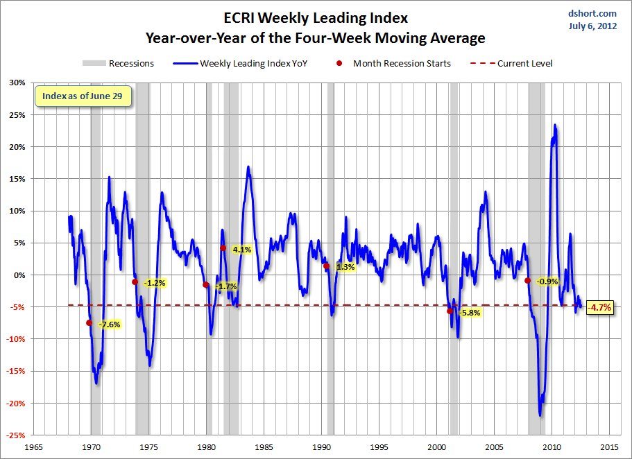
This next chart depicts, on a long-term basis, the Year-over-Year change in the 4-week moving average of the WLI:


-

This last chart depicts, on a long-term basis, the WLI, Gr.:


_________

I post various economic indicators and indices because I believe they should be carefully monitored.  However, as those familiar with this blog are aware, I do not necessarily agree with what they depict or imply.
_____

The Special Note summarizes my overall thoughts about our economic situation

SPX at 1354.68 as this post is written

Saturday, July 7, 2012

U-3 And U-6 Unemployment Rate Long-Term Reference Charts As Of July 6, 2012


Shortly after each monthly employment report I have been posting a continual series titled “3 Critical Unemployment Charts.”

Of course, there are many other employment charts that can be displayed as well.

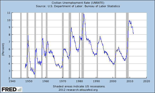
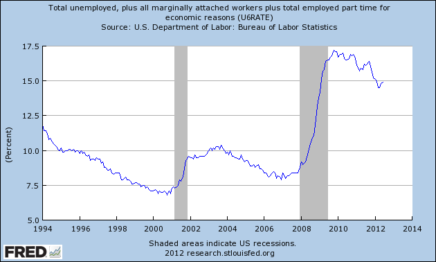
For reference purposes, below are the U-3 and U-6 Unemployment Rate charts from a long-term historical perspective.  Both charts are from the St. Louis Fed site.  The U-3 measure is what is commonly referred to as the official unemployment rate; whereas the U-6 rate is officially (per Bureau of Labor Statistics) defined as:
Total unemployed, plus all persons marginally attached to the labor force, plus total employed part time for economic reasons, as a percent of the civilian labor force plus all persons marginally attached to the labor force
Of note, many economic observers use the U-6 rate as a (closer) proxy of the actual unemployment rate rather than that depicted by the U-3 measure.

Here is the U-3 chart, currently showing a 8.2% unemployment rate:

(click on charts to enlarge images)(charts updated as of 7-6-12)


-

Here is the U-6 chart, currently showing a 14.9% unemployment rate:


_____

The Special Note summarizes my overall thoughts about our economic situation

SPX at 1354.68 as this post is written

3 Critical Unemployment Charts – July 2012


As I have commented previously, as in the October 6, 2009 post (“A Note About Unemployment Statistics”), in my opinion the official methodologies used to measure the various job loss and unemployment statistics do not provide an accurate depiction; they serve to understate the severity of unemployment.

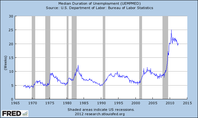
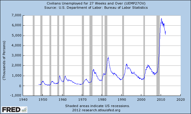
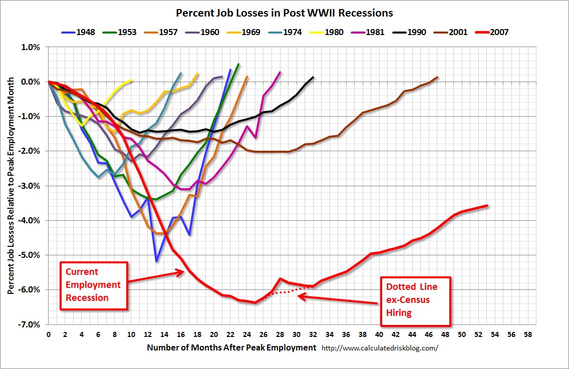
However, even if one chooses to look at the official statistics, the following charts provide an interesting (and disconcerting) long-term perspective of certain aspects of the officially-stated unemployment situation.

The first two charts are from the St. Louis Fed site.  Here is the Median Duration of Unemployment (current value = 19.8 weeks) :

(click on charts to enlarge images)(charts updated as of 7-6-12)


-

Here is the chart for Unemployed 27 Weeks and Over (current value =  5.370 million) :


-

Lastly, a chart from the CalculatedRisk.com site, from the July 6 post titled “June Employment Report:  80,000 Jobs, 8.2% Unemployment Rate.”  This shows the employment situation vs. that of previous recessions, as shown:


-

As depicted by these charts, our unemployment problem is severe.  Unfortunately, there do not appear to be any “easy” solutions.

On April 24 I wrote a five-part blog post titled “The Unemployment Situation Facing The United States”, which discusses various problematical issues concerning the present and future employment situation.
_____

The Special Note summarizes my overall thoughts about our economic situation

SPX at 1354.68 as this post is written