Thursday, January 31, 2013

Velocity Of Money – Charts Updated Through January 30, 2013


Here are three charts from the St. Louis Fed depicting the velocity of money in terms of the MZM, M1 and M2 money supply measures.

All charts reflect quarterly data through the fourth quarter of 2012, and were last updated as of January 30, 2013.  As one can see, two of the three measures are at all-time lows for the periods measured:

Velocity of MZM Money Stock, current value = 1.387 :

MZMV_1-30-13 1.387

-

Velocity of M1 Money Stock, current value = 6.538 :

M1V_1-30-13 6.538

-

Velocity of M2 Money Stock, current value = 1.535 :

M2V_1-30-13 1.535

_____

The Special Note summarizes my overall thoughts about our economic situation

SPX at 1502.32 as this post is written

Wednesday, January 30, 2013

Corporate Profits As A Percentage Of GDP


In the December 3, 2012 post ("3rd Quarter Corporate Profits") I displayed, for reference purposes, a long-term chart depicting Corporate Profits.

There are many ways to view this measure, both on an absolute as well as relative basis.

One relative measure is viewing Corporate Profits as a Percentage of GDP.  I feel that this metric is important for a variety of reasons.  As well, the measure is important to a variety of parties, including investors, businesses, and government policy makers.

As one can see from the  long-term chart below (updated through 7-1-12), Corporate Profits as a Percentage of GDP is at levels that can be seen as historically (very) high.  While there are many reasons as to why this is so, from a going-forward standpoint I think it is important to recognize both that such a notable condition exists, as well as contemplate and/or plan for such factors and conditions that would come about if (and in my opinion "when") a more historically "normal" ratio of Corporate Profits as a Percentage of GDP occurs.  This topic can be very complex in nature, and depends upon myriad factors.  In my opinion it deserves far greater recognition.

(click on chart to enlarge image)

CP-GDP 7-1-12

_____

The Special Note summarizes my overall thoughts about our economic situation

SPX at 1503.66 as this post is written

Tuesday, January 29, 2013

Durable Goods New Orders – Long-Term Charts Through December 2012


Many people place emphasis on Durable Goods New Orders as a prominent economic indicator and/or leading economic indicator.

For reference, below are charts depicting this measure.

First, from the St. Louis Fed site (FRED), a chart through December, last updated on January 28.  This value is 230,742 ($ Millions) :

(click on charts to enlarge images)

DGORDER_1-28-13 230742

-

Here is the chart depicting this measure on a “Percentage Change from a Year Ago” basis:

DGORDER_1-28-13 Percent Change from Year Ago

_________

I post various indicators and indices because I believe they should be carefully monitored.  However, as those familiar with this blog are aware, I do not necessarily agree with what they depict or imply.
_____

The Special Note summarizes my overall thoughts about our economic situation

SPX at 1499.84 as this post is written

Monday, January 28, 2013

Median Household Income Chart


I have written many blog posts concerning the worrisome trends in income and earnings.

Doug Short, in his January 25 blog post, titled "Median Household Incomes:  Down .5% in 2012" produced the chart below.  It is based upon data from Sentier Research, and it shows both nominal and real median household incomes since 2000, as depicted.  As one can see, post-recession real median household income (seen in the blue line since 2009) is especially worrisome.

(click on chart to enlarge image)

Dshort 1-25-13 household-income-monthly-median-since-2000

-

As Doug mentions in his aforementioned blog post:
Nominal household incomes rose 1.3% for the calendar year, but adjusted for inflation, household incomes declined by 0.5%. Real household incomes have essentially been flat for the past seven months and are down 7.9% thus far in the 21st century.
_____

The Special Note summarizes my overall thoughts about our economic situation

SPX at 1501.79 as this post is written

Friday, January 25, 2013

Long-Term Charts Of The ECRI WLI & ECRI WLI, Gr. – January 25, 2013 Update


As I stated in my July 12, 2010 post ("ECRI WLI Growth History"):
For a variety of reasons, I am not as enamored with ECRI’s WLI and WLI Growth measures as many are.
However, I do think the measures are important and deserve close monitoring and scrutiny.
The movement of the ECRI WLI and WLI, Gr. is particularly notable at this time, as ECRI publicly announced on September 30, 2011 that the U.S. was “tipping into recession,” and ECRI has reiterated the view that the U.S. economy is currently in a recession, seen most recently in these two media sources of December 7, 2012:
“Reviewing the indicators used to officially decide U.S. recession dates, it looks like the recession began around July 2012.”
Other past notable 2012 reaffirmations of the September 30, 2011 recession call by ECRI were seen (in chronological order)  on March 15 (“Why Our Recession Call Stands”) as well as various interviews and statements the week of May 6, including:
Also, subsequent to May 2012:
-

Below are three long-term charts, from Doug Short’s blog post of January 25 titled “ECRI 'Recession' Update - Leading Index Growth Hits a New Interim High.”  These charts are on a weekly basis through the January 25 release, indicating data through January 18, 2013.

Here is the ECRI WLI (defined at ECRI’s glossary):

(click on charts to enlarge images)

Dshort 1-25-13 ECRI-WLI 130.6

-

This next chart depicts, on a long-term basis, the Year-over-Year change in the 4-week moving average of the WLI:

Dshort 1-25-13 ECRI-WLI-YoY 5.8 percent

-

This last chart depicts, on a long-term basis, the WLI, Gr.:

Dshort 1-25-13 ECRI-WLI-growth-since-1965 7.2

_________

I post various economic indicators and indices because I believe they should be carefully monitored.  However, as those familiar with this blog are aware, I do not necessarily agree with what they depict or imply.
_____

The Special Note summarizes my overall thoughts about our economic situation

SPX at 1502.04 as this post is written

St. Louis Financial Stress Index – January 24, 2013 Update


On March 28, 2011 I wrote a post ("The STLFSI") about the  St. Louis Fed’s Financial Stress Index (STLFSI) which is supposed to measure stress in the financial system.  For reference purposes, the most recent chart is seen below.  This chart was last updated on January 24, incorporating data from December 31,1993 to January 18, 2013 on a weekly basis.  The January 18, 2013 value is -.515 :

(click on chart to enlarge image)

STLFSI_1-24-13 -.515

-

Here is the STLFSI chart from a 1-year perspective:

STLFSI_1-24-13 -.515 1-year

_________

I post various indicators and indices because I believe they should be carefully monitored.  However, as those familiar with this blog are aware, I do not necessarily agree with what they depict or imply.
_____

The Special Note summarizes my overall thoughts about our economic situation

SPX at 1494.82 as this post is written

Thursday, January 24, 2013

Current Economic Situation


With regard to our current economic situation,  my thoughts can best be described/summarized by the posts found under the 20 “Building Financial Danger” posts.

My thoughts concerning our ongoing economic situation – with future implications – can be seen on the page titled “A Special Note On Our Economic Situation,” which has been found near the bottom of every blog post since August 15, 2010.
_____

The Special Note summarizes my overall thoughts about our economic situation

SPX at 1494.81 as this post is written

Wednesday, January 23, 2013

Updates Of Economic Indicators January 2013


Here is an update on various indicators that are supposed to predict and/or depict economic activity.  These indicators have been discussed in previous blog posts:

The January Chicago Fed National Activity Index (CFNAI)(pdf) updated as of January 22, 2013:

cfnai_monthly_MA3 1-22-13

-


As of 1/18/13 (incorporating data through 1/11/13) the WLI was at 130.4 and the WLI, Gr. was at 6.1%.

A chart of the WLI, Gr. since 2000, from Doug Short’s blog of January 18 titled “ECRI's Public Indicators Continue to Undermine Their Insistence That We're in a Recession” :

Dshort 1-18-13 ECRI-WLI-growth-since-2000 6.1

-


Here is the latest chart, depicting 1-12-11 to 1-12-13:

ads_2yrs_1-12-11 - 1-12-13

-


As per the December 20 press release, the LEI was at 95.8 and the CEI was at 104.9 in November.
An excerpt from the December 20 release:
Says Ken Goldstein, economist at The Conference Board: “The indicators reflect an economy that remains weak in the face of strong domestic and international headwinds, as it faces a looming fiscal cliff. Growth will likely be slow through the early months of 2013.”
Here is a chart of the LEI from Doug Short’s blog post of December 20 titled “Conference Board Leading Economic Index:  Six-Month Growth at Zero” :

Dshort 12-20-12 CB-LEI

_________

I post various indicators and indices because I believe they should be carefully monitored.  However, as those familiar with this blog are aware, I do not necessarily agree with what they depict or imply.
_____

The Special Note summarizes my overall thoughts about our economic situation

SPX at 1493.53 as this post is written

Tuesday, January 22, 2013

Recession Probability Models


There are a variety of economic models that are supposed to predict the probabilities of recession.

While I don’t agree with the methodologies employed or probabilities of impending economic weakness as depicted by the following two models, I think the results of these models should be monitored.

Please note that each of these models is updated regularly, and the results of these – as well as other recession models – can fluctuate significantly.

The first is the “Yield Curve as a Leading Indicator” from the New York Federal Reserve.  I wrote a blog post concerning this measure on March 1, 2010, titled “The Yield Curve as a Leading Indicator.”

Currently (last updated January 15, using data through December) this “Yield Curve” model shows a 5.74% probability of a recession in the United States twelve months ahead.  It showed a 6.42% probability through November.

The second model is from Marcelle Chauvet and Jeremy Piger.  This model is described on the St. Louis Federal Reserve site (FRED) as follows:
Smoothed recession probabilities for the United States are obtained from a dynamic-factor markov-switching model applied to four monthly coincident variables: non-farm payroll employment, the index of industrial production, real personal income excluding transfer payments, and real manufacturing and trade sales. This model was originally developed in Chauvet, M., “An Economic Characterization of Business Cycle Dynamics with Factor Structure and Regime Switching,” International Economic Review, 1998, 39, 969-996. (http://faculty.ucr.edu/~chauvet/ier.pdf)
This model, last updated on January 2, 2013, currently shows a 7.34% probability using data through October.

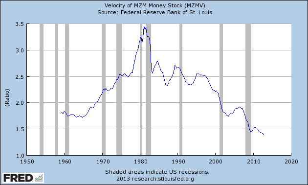
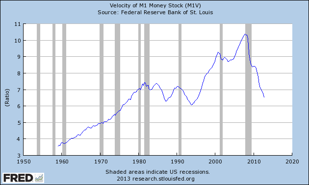
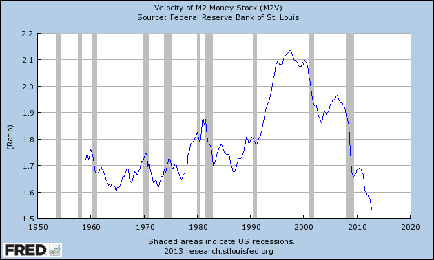
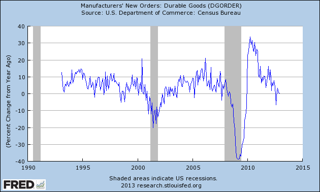
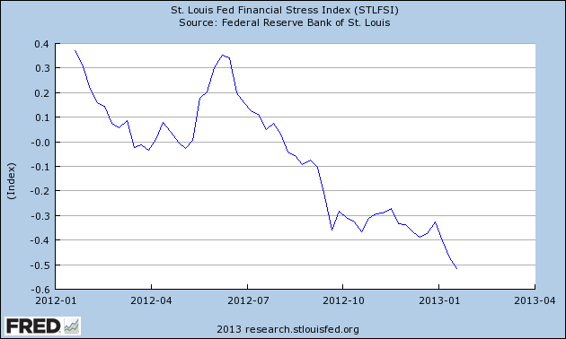
Here is the FRED chart (last updated January 2) :

(click on chart to enlarge image)

RECPROUSM156N_1-2-13 7.34 percent

-

The two models featured above can be compared against measures seen in recent blog posts.  For instance, as seen in the January 14 post titled "The January 2013 Wall Street Journal Economic Forecast Survey" economists surveyed averaged a 19% probability of a U.S. recession within the next 12 months.

Of course, there is a (very) limited number of prominent parties, such as ECRI (most recently featured in the January 18 post titled "Long-Term Charts Of The ECRI WLI & ECRI WLI,Gr. - January 18, 2013 Update") that believe the U.S. is already experiencing a recession.
_____

The Special Note summarizes my overall thoughts about our economic situation

SPX at 1485.98 as this post is written

Friday, January 18, 2013

Long-Term Charts Of The ECRI WLI & ECRI WLI, Gr. – January 18, 2013 Update


As I stated in my July 12, 2010 post ("ECRI WLI Growth History"):
For a variety of reasons, I am not as enamored with ECRI’s WLI and WLI Growth measures as many are.
However, I do think the measures are important and deserve close monitoring and scrutiny.
The movement of the ECRI WLI and WLI, Gr. is particularly notable at this time, as ECRI publicly announced on September 30, 2011 that the U.S. was “tipping into recession,” and ECRI has reiterated the view that the U.S. economy is currently in a recession, seen most recently in these two media sources of December 7, 2012:
“Reviewing the indicators used to officially decide U.S. recession dates, it looks like the recession began around July 2012.”
Other past notable 2012 reaffirmations of the September 30, 2011 recession call by ECRI were seen (in chronological order)  on March 15 (“Why Our Recession Call Stands”) as well as various interviews and statements the week of May 6, including:
Also, subsequent to May 2012:
-

Below are three long-term charts, from Doug Short’s blog post of January 18 titled “ECRI’s Public Indicators Continue to Undermine Their Insistence That We're in a Recesion.”  These charts are on a weekly basis through the January 18 release, indicating data through January 11, 2013.

Here is the ECRI WLI (defined at ECRI’s glossary):

(click on charts to enlarge images)

Dshort 1-18-13 ECRI-WLI 130.4

-

This next chart depicts, on a long-term basis, the Year-over-Year change in the 4-week moving average of the WLI:

Dshort 1-18-13 ECRI-WLI-YoY 5.6 percent

-

This last chart depicts, on a long-term basis, the WLI, Gr.:

Dshort 1-18-13 ECRI-WLI-growth-since-1965 6.1

_________

I post various economic indicators and indices because I believe they should be carefully monitored.  However, as those familiar with this blog are aware, I do not necessarily agree with what they depict or imply.
_____

The Special Note summarizes my overall thoughts about our economic situation

SPX at 1483.05 as this post is written

St. Louis Financial Stress Index – January 17, 2013 Update


On March 28, 2011 I wrote a post ("The STLFSI") about the  St. Louis Fed’s Financial Stress Index (STLFSI) which is supposed to measure stress in the financial system.  For reference purposes, the most recent chart is seen below.  This chart was last updated on January 17, incorporating data from December 31,1993 to January 11, 2013 on a weekly basis.  The January 11, 2013 value is -.462 :

(click on chart to enlarge image)

STLFSI_1-17-13 -.462

-

Here is the STLFSI chart from a 1-year perspective:

STLFSI_1-17-13 -.462 1-year

_________

I post various indicators and indices because I believe they should be carefully monitored.  However, as those familiar with this blog are aware, I do not necessarily agree with what they depict or imply.
_____

The Special Note summarizes my overall thoughts about our economic situation

SPX at 1480.94 as this post is written

Thursday, January 17, 2013

Food Stamps As Of January 17, 2013


This post is an update to previous posts concerning food stamps.  The program is officially called “Supplemental Nutrition Assistance Program,” or SNAP.  As stated on the SNAP website, “As of Oct. 1, 2008, Supplemental Nutrition Assistance Program (SNAP) is the new name for the federal Food Stamp Program.”

The data was last updated January 4, 2013, reflecting October 2012 levels.

Here is a table showing various monthly statistics with regard to national participation and costs going back to FY2011.  As seen in this table, the number of people participating as of October 2012 is 47,525,329 up 2.78% from year-ago (October 2011) levels.  As a reference point, the figure as of June 2009 (the official end of the recession as defined by the NBER) was 34,882,031.  Longer-term annual data is also available.

As I wrote in the April 12, 2010 post, “Of course, what is particularly disconcerting is not only the extent of participation in these programs, but the fact that this is yet another notable statistic that is getting worse well after the purported end of the recession.”
_____

The Special Note summarizes my overall thoughts about our economic situation

SPX at 1476.09 as this post is written

Tuesday, January 15, 2013

The S&P500 Vs. The Shanghai Stock Exchange Composite Index – January 15, 2013


Starting on May 3, 2010 I have written posts concerning the notable divergence that has occurred between the S&P500 and Chinese (Shanghai Composite) stock markets.

The chart below illustrates this divergence; it shows the S&P500 vs. the Shanghai Composite on a daily basis, since 2006:

(click on chart to enlarge image)(chart courtesy of StockCharts.com; chart creation and annotation by the author)

EconomicGreenfield 1-15-13 SPX v SSEC

-

It is notable that the Shanghai Composite led the SPX (S&P500) significantly in late ’08 – early ’09, yet it has been (generally) declining since that time.

I continue to find this divergence between the S&P500 and  Shanghai Composite to be notable and disconcerting, on an “all things considered” basis.
_____

The Special Note summarizes my overall thoughts about our economic situation

SPX at 1464.91 as this post is written

Monday, January 14, 2013

The January 2013 Wall Street Journal Economic Forecast Survey


The January Wall Street Journal Economic Forecast Survey was published on January 10, 2013.  The headline is “'Cliff' Deal Seen Hitting Growth.”

Although I don’t agree with various aspects of the survey’s contents, I found numerous items to be notable, both within the article and in the Q&A found in the spreadsheet.

An excerpt from the article:
The economists expect the economy to expand at a tepid 2.3% pace in 2013, barely above the 2% rate they estimate for growth last year. That isn't fast enough to bring down the unemployment rate quickly. On average, the economists still expect a 7.4% unemployment rate at year-end, compared with the current 7.8%. They don't see unemployment falling below 7% until sometime in 2015.
Though the economists were largely unimpressed with the deal to avert the fiscal cliff, only 15 respondents said the agreement is actively bad for the economy. Indeed the average odds of a recession in the next 12 months tumbled to 19% from 24% last month, the first time they have been below 20% since last June.

The current average forecasts among economists polled include the following:

GDP:
full-year 2012:  2.0%
full-year 2013:  2.3%
full-year 2014:  2.9%
full-year 2015:  3.0%

Unemployment Rate:
December 2013: 7.4%
December 2014: 7.0%
December 2015: 6.4%

10-Year Treasury Yield:
December 2013: 2.34%
December 2014: 2.97%
December 2015: 3.59%

CPI:
December 2013:  2.0%
December 2014:  2.3%
December 2015:  2.5%

Crude Oil  ($ per bbl):
for 12/31/2013: $94.54

(note: I highlight this WSJ Economic Forecast survey each month; commentary on past surveys can be found under the “Economic Forecasts” label)
_____

I post various economic forecasts because I believe they should be carefully monitored.  However, as those familiar with this blog are aware, I do not necessarily agree with many of the consensus estimates and much of the commentary in these forecast surveys.
_____

The Special Note summarizes my overall thoughts about our economic situation

SPX at 1469.54 as this post is written