This post is an update to recent posts that began on October 6 ("A Chart Of Recent S&P500 Price Volatility") on stock market volatility.
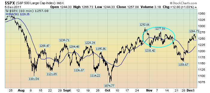
While I track many different measures of volatility, I find the following chart to be both simple and clear in depicting the recent outsized volatility in the stock market.
This chart depicts the S&P500 in 60 minute intervals from July 20 through yesterday’s (December 5) close. As such, it encompasses the progression of the stock market since its July 25 daily high of 1344.32:
(click on chart to enlarge image)(chart courtesy of StockCharts.com)
The blue line is a 50-period moving average. The light blue circle represents a period of reduced price fluctuations.
I continue to believe that this volatility is notable and has important implications.
As I wrote in the above-referenced October 6 post:
What I find notable is the frequency and extent of the price volatility. As one can see, there have been several episodes of advances and declines of roughly 80-100+ points in rapid fashion – some even happening over the course of a few days.
While there are various ways to interpret such volatility, my overall belief is that such is (yet another) cautionary sign.
_____
The Special Note summarizes my overall thoughts about our economic situation
SPX at 1257.08 as this post is written

No comments:
Post a Comment