On June 29, 2011 I wrote a blog post titled “Financial Stocks – Notable Price Action.”
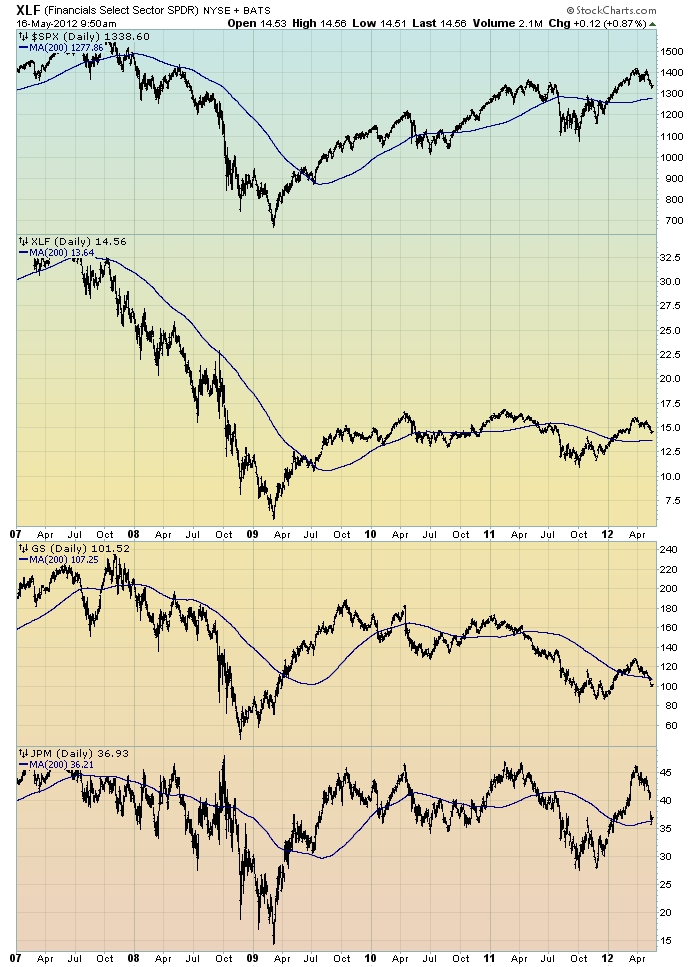
Although financial stocks have increased in price in 2012, I continue to believe that the longer-term “price action” of various financial stocks is disconcerting. I view the poor performance of these financial and brokerage stocks to be one indicator among (very) many that serves as a “red flag” as to the financial markets and economy as a whole.
Here is an updated chart to that shown in the aforementioned June 29, 2011 post. It shows the XLF (the financial ETF) on a daily basis since 2007. As well, the S&P500 is plotted above it, with GS and JPM shown below it. The blue line on each indicates the 200dma:
(click on chart image to enlarge)(chart courtesy of StockCharts.com; chart created by and annotated by author)
_____
The Special Note summarizes my overall thoughts about our economic situation
SPX at 1340.28 as this post is written

No comments:
Post a Comment