I find the following charts to be disturbing. These charts would be disturbing at any point in the economic cycle; that they (on average) depict such a tenuous situation now – 55 months after the official (as per the September 20, 2010 NBER BCDC announcement) June 2009 end of the recession – is especially notable.
These charts raise a lot of questions. As well, they highlight the “atypical” nature of our economic situation from a long-term historical perspective.
All of these charts (except one, as noted) are from the Federal Reserve, and represent the most recently updated data.
The following eight charts are from the St. Louis Federal Reserve:
(click on charts to enlarge images)
Housing starts (last updated 12-18-13):
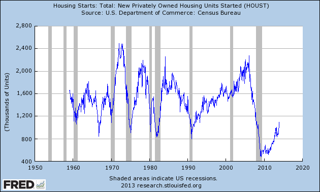
-
The Federal Deficit (last updated 11-1-13):
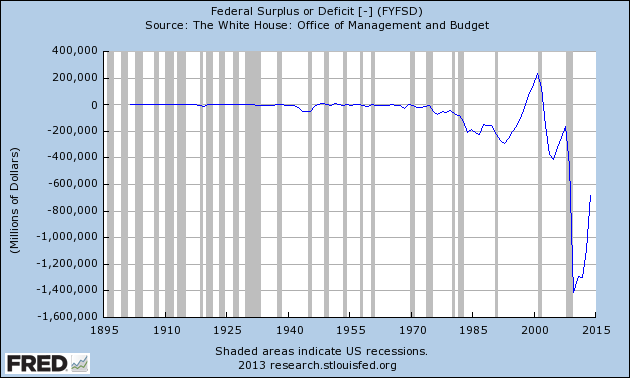
-
Federal Net Outlays (last updated 11-1-13):
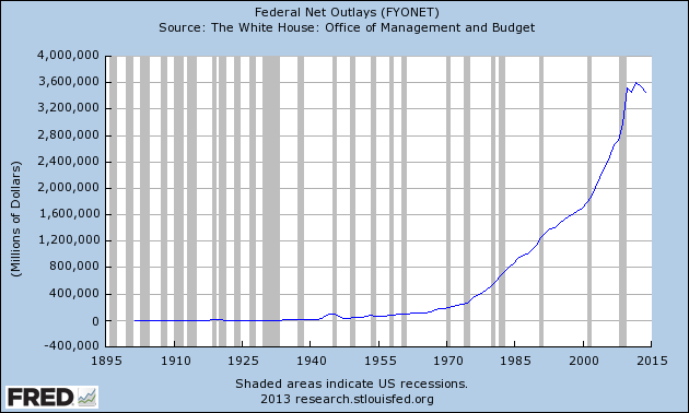
-
State & Local Personal Income Tax Receipts (% Change from Year Ago)(last updated 7-31-13):
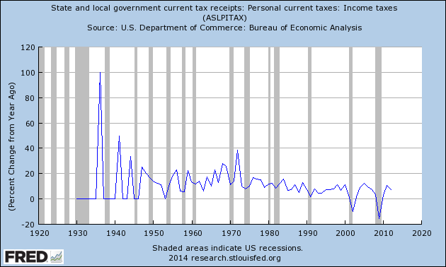
-
Total Loans and Leases of Commercial Banks (% Change from Year Ago)(last updated 1-10-14):
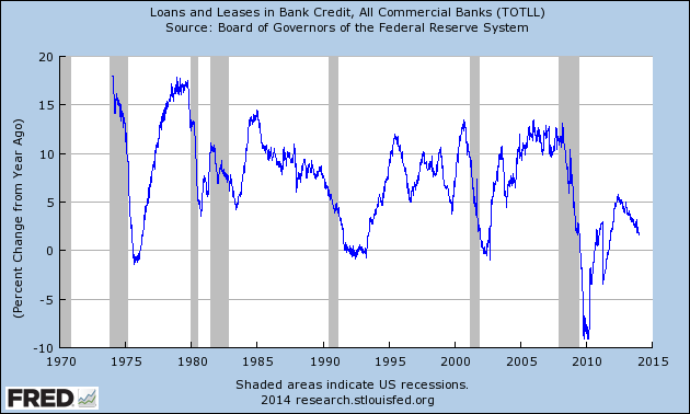
-
Bank Credit – All Commercial Banks (% Change from Year Ago)(last updated 1-10-14):
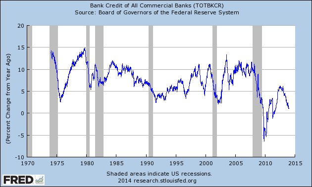
-
M1 Money Multiplier (last updated 1-2-14):
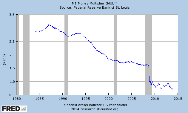
-
Median Duration of Unemployment (last updated 1-10-14):
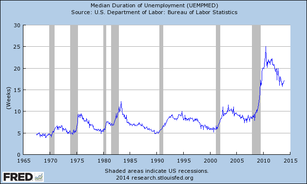
-
This next chart is from the CalculatedRisk.com blog post of January 10, 2014, titled “December Employment Report: 74,000 Jobs, 6.7% Unemployment Rate” and it shows (in red) the relative length and depth of this downturn and subsequent recovery from an employment perspective:
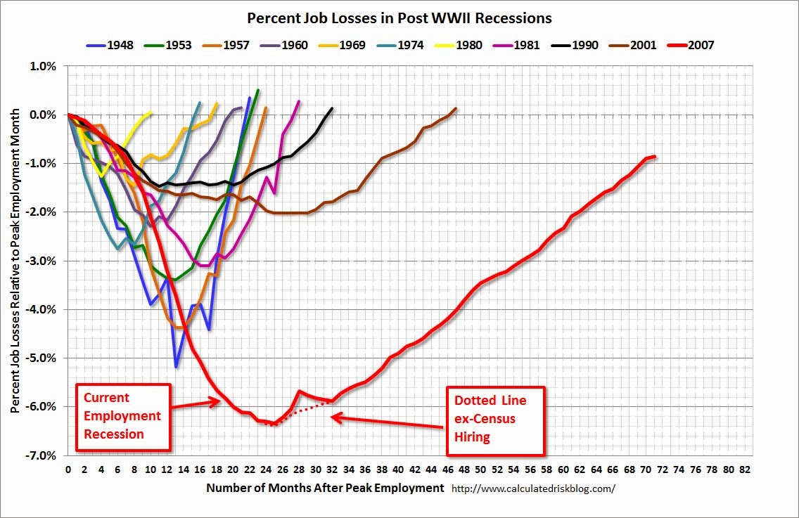
-
This last chart is of the Chicago Fed National Activity Index (CFNAI, and its 3-month moving average CFNAI-MA3) and it depicts broad-based economic activity (last updated 12-23-13):
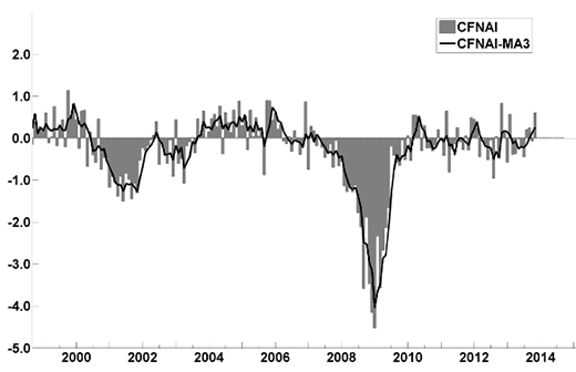
-
I will continue to update these charts on an intermittent basis as they deserve close monitoring…
_____
The Special Note summarizes my overall thoughts about our economic situation
SPX at 1838.88 as this post is written
No comments:
Post a Comment