In the June 29, 2011 post (“Financial Stocks – Notable Price Action”) I wrote the following:
I think that the relatively poor “price action” of various financial stocks is notable. It is one of many current indications that overall stock market health is not as strong as a casual glance at the major indices would indicate.
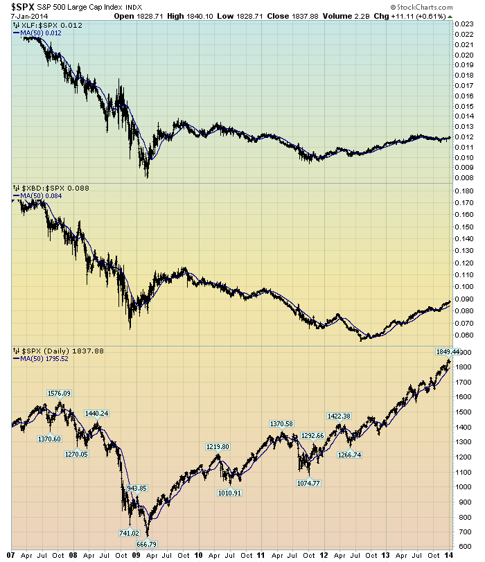
I continue to believe that the "lagging" prices of various financial stocks is highly notable. Here is a chart that I created a while ago that provides another view of the poor “price action” of the financial stocks vs. that of the entire stock market, as depicted by the S&P500:
(click on chart to enlarge image)(chart courtesy of StockCharts.com; chart created by and annotated by author)
-
The above chart is depicted on a daily basis since 2007. On each of the three plots, a blue line depicts the 50dma for perspective.
As one can see, there has been an interesting progression of the relative price of the XLF (Financial SPDR) vs. the S&P500, as seen in the top of the chart. In the middle of the chart, the same can be seen in the $XBD (Broker/Dealer Index). The relative price of both the XLF and $XBD remain subdued relative to past levels, even though the price increase of the S&P500 (plotted on the bottom of the chart) has been robust.
In my experience, any time the financials lag the general stock market for a considerable period, it is generally a “red flag” that should be closely monitored.
_____
The Special Note summarizes my overall thoughts about our economic situation
SPX at 1833.17 as this post is written
No comments:
Post a Comment