I have written extensively about U.S. interest rates and their importance. Rising interest rates have substantial ramifications for many aspects of the current-day economy. My commentaries with regard to interest rates and the bond bubble are largely found under the “bond bubble” label. From an intervention perspective commentary is found under the “Intervention” label.
Lately interest rates, including the 10-Year Treasury yield, have been increasing. An excerpt from the March 13, 2017 Wall Street Journal article titled “U.S. 10-Year Bond Yield Closes at Highest Level Since September 2014”:
The yield on the benchmark 10-year Treasury note closed Monday at the highest level in more than two years, deepening its rise this month as investors expect that the Federal Reserve will raise short-term interest rates later this week.The yield on the 10-year note settled at 2.609%, compared with 2.582% Friday. It toppled the recent peak of 2.6% closed in mid-December and marked the highest close since September 2014. Yields rise as bond prices fall.
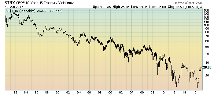
As reference, here is a long-term chart of the 10-Year Treasury yield since 1980, depicted on a monthly basis, LOG scale:
(click on charts to enlarge images)(charts courtesy of StockCharts.com; chart creation and annotation by the author)
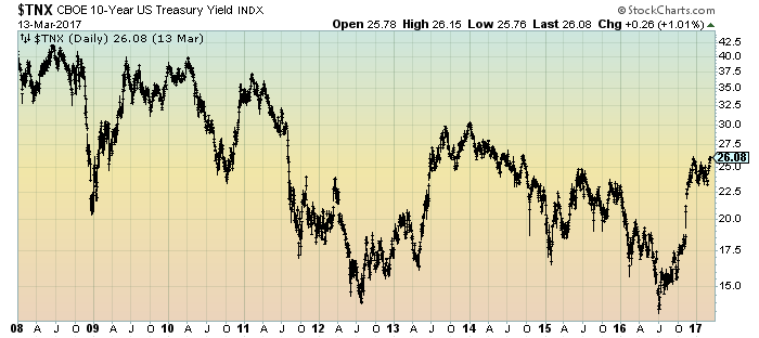
Here is a long-term chart of the 10-Year Treasury yield since 2008, depicted on a daily basis, LOG scale:
_____
The Special Note summarizes my overall thoughts about our economic situation
SPX at 2364.18 as this post is written
No comments:
Post a Comment