Friday, August 31, 2012

St. Louis Financial Stress Index – August 30, 2012 Update


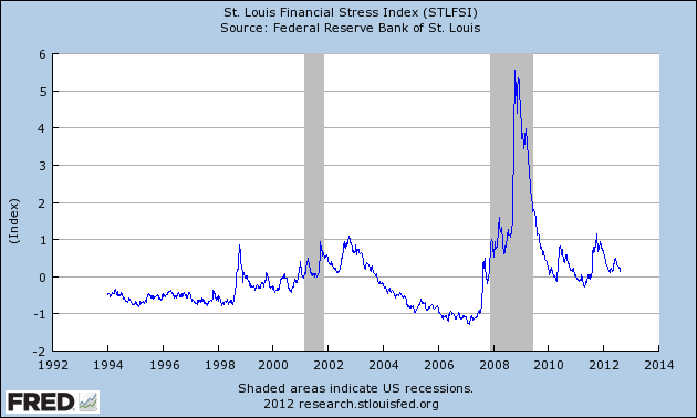
On March 28, 2011 I wrote a post ("The STLFSI") about the  STLFSI (St. Louis Fed’s Financial Stress Index) which is supposed to measure stress in the financial system.  For reference purposes, the most recent chart is seen below.  This chart was last updated on August 30, incorporating data from December 31,1993 to August 24, 2012 on a weekly basis.  The August 24, 2012 value is .073 :

(click on chart to enlarge image)


_________

I post various indicators and indices because I believe they should be carefully monitored.  However, as those familiar with this blog are aware, I do not necessarily agree with what they depict or imply.
_____

The Special Note summarizes my overall thoughts about our economic situation

SPX at 1405.78 as this post is written

Sunday, August 26, 2012

Long-Term Charts Of The ECRI WLI & ECRI WLI, Gr. – August 24, 2012 Update


As I stated in my July 12, 2010 post ("ECRI WLI Growth History"):
For a variety of reasons, I am not as enamored with ECRI’s WLI and WLI Growth measures as many are.
However, I do think the measures are important and deserve close monitoring and scrutiny.
The movement of the ECRI WLI and WLI, Gr. is particularly notable at this time, as ECRI publicly announced on September 30, 2011 that the U.S. was “tipping into recession,” and ECRI has reaffirmed that view since, most recently in a Bloomberg interview of July 10 titled “Recession Here” in which Lakshman Achuthan argues that the U.S. is now in a recession.

Other past notable reaffirmations of the September 30, 2011 recession call by ECRI were seen (in chronological order)  on March 15 (“Why Our Recession Call Stands”) as well as various interviews and statements the week of May 6, including:


Wall Street Journal video, May 9: “Free Market Economies Have Business Cycles

Below are three long-term charts, from Doug Short’s blog post of August 24 titled “Economic Data Continues to Refute ECRI's Recession Call.”  These charts are on a weekly basis through the August 24 release, indicating data through August 17, 2012.

Here is the ECRI WLI (defined at ECRI’s glossary):

(click on charts to enlarge images)


-

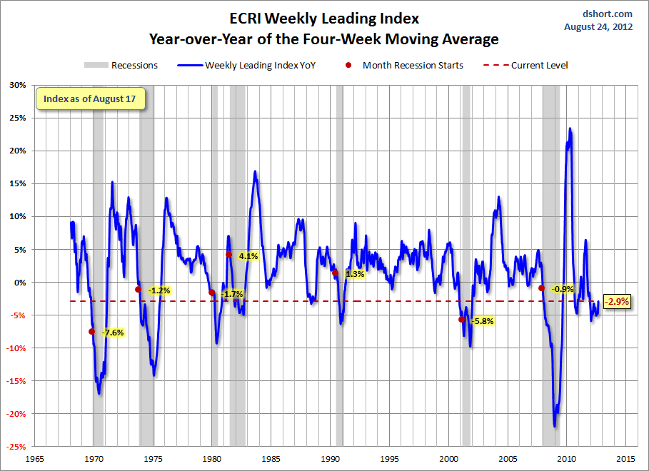
This next chart depicts, on a long-term basis, the Year-over-Year change in the 4-week moving average of the WLI:


-

This last chart depicts, on a long-term basis, the WLI, Gr.:


_________

I post various economic indicators and indices because I believe they should be carefully monitored.  However, as those familiar with this blog are aware, I do not necessarily agree with what they depict or imply.
_____

The Special Note summarizes my overall thoughts about our economic situation

SPX at 1411.13 as this post is written

Saturday, August 25, 2012

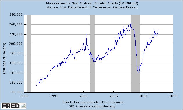
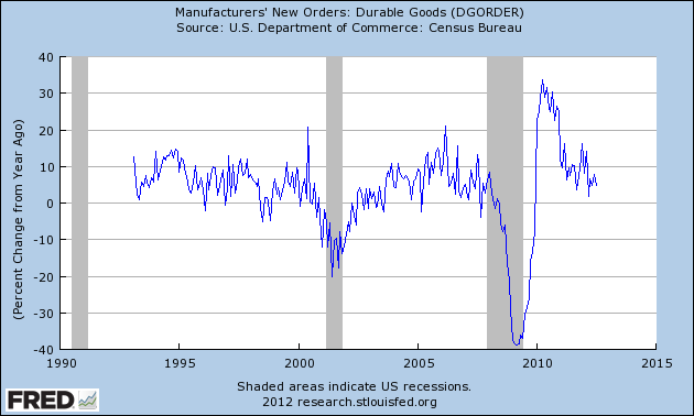
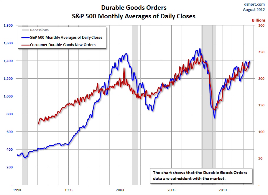
Durable Goods New Orders – Long-Term Charts Through July 2012


Many people place emphasis on Durable Goods New Orders as a prominent economic indicator and/or leading economic indicator.

For reference, here are a few charts depicting this measure.

First, from the St. Louis Fed site (FRED), a chart through July, last updated on August 24.  This value is 230,733 ($ Millions) :

(click on charts to enlarge images)


-

Here is the chart depicting this measure on a Percentage Change from a Year Ago basis:


-

Lastly, a chart from Doug Short’s post of August 24 titled “Durable Goods Orders Up 4.2%, Above Expectations; But ex Transportation, Down .4%” showing the Durable Goods New Orders vs. the S&P500′s monthly average of daily closes:


_____

The Special Note summarizes my overall thoughts about our economic situation

SPX at 1411.13 as this post is written

Friday, August 24, 2012

St. Louis Financial Stress Index – August 23, 2012 Update


On March 28, 2011 I wrote a post ("The STLFSI") about the  STLFSI (St. Louis Fed’s Financial Stress Index) which is supposed to measure stress in the financial system.  For reference purposes, the most recent chart is seen below.  This chart was last updated on August 23, incorporating data from December 31,1993 to August 17, 2012 on a weekly basis.  The August 17, 2012 value is .113 :

(click on chart to enlarge image)


_________

I post various indicators and indices because I believe they should be carefully monitored.  However, as those familiar with this blog are aware, I do not necessarily agree with what they depict or imply.
_____

The Special Note summarizes my overall thoughts about our economic situation

SPX at 1412.43 as this post is written

Tuesday, August 21, 2012

Updates On Economic Indicators August 2012


Here is an update on various indicators that are supposed to predict and/or depict economic activity.  These indicators have been discussed in previous blog posts:

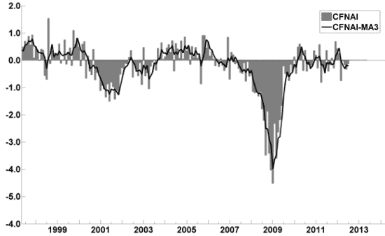
The August Chicago Fed National Activity Index (CFNAI)(pdf) updated as of August 20, 2012:


-


An excerpt from the July 19 update titled “Index forecasts weaker growth” :
The July update of the USA TODAY/IHS Global Insight Economic Outlook Index shows real GDP growth, at a six-month annualized growth rate, slowing to 1.6% in July and then increasing to 2% by year end. While employment, housing (mostly the multifamily sector) and consumer spending are slowly recovering, concerns about the Eurozone and world growth continue.
-


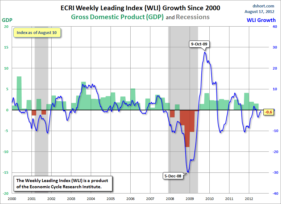
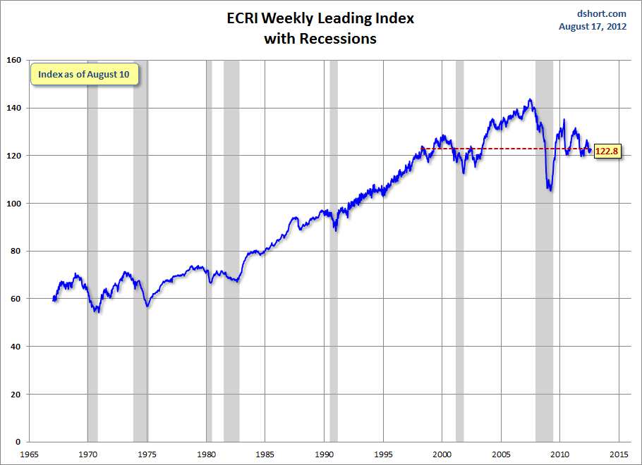
As of 8/17/12 (incorporating data through 8/10/12) the WLI was at 122.8 and the WLI, Gr. was at -.6%.

A chart of the WLI, Gr. since 2000, from Doug Short’s blog of August 17 titled “ECRI Weekly Leading Index Continues to Undermine ECRI’s Recession Call” :


-


Here is the latest chart, depicting 8-11-10 to 8-11-12:


-


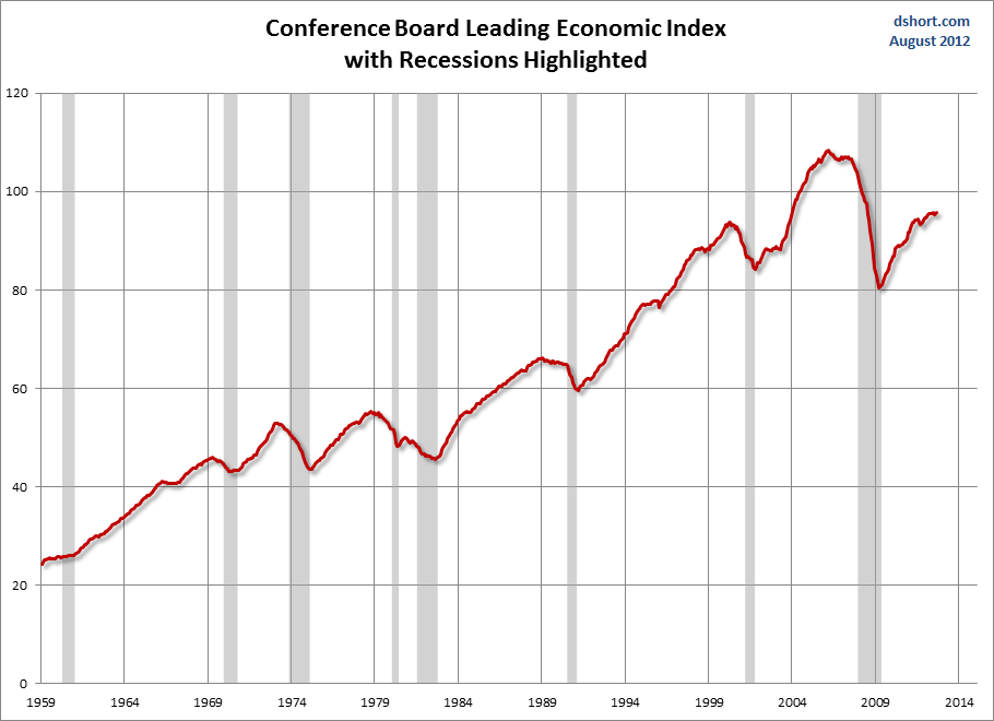
As per the August 17 release, the LEI was at 95.8 and the CEI was at 105.1 in July.

An excerpt from the August 17 release:
Says Ken Goldstein, economist at The Conference Board: “The indicators point to slow growth through the end of 2012. Lack of domestic demand remains a big issue. However, back-to-school sales are better than expected, suggesting that the consumer is starting to come back. Retail sales this time of year are often an indicator of how the holiday season will turn out.”
Here is a chart of the LEI from Doug Short’s blog post of August 17, titled “Conference Board Leading Economic Index:  Slow Growth Through the End of 2012” :


_________

I post various indicators and indices because I believe they should be carefully monitored.  However, as those familiar with this blog are aware, I do not necessarily agree with what they depict or imply.
_____

The Special Note summarizes my overall thoughts about our economic situation

SPX at 1418.13 as this post is written

Monday, August 20, 2012

Disturbing Charts (Update 8)


I find the following charts to be disturbing.   These charts would be disturbing at any point in the economic cycle; that they depict such a tenuous situation now – 38 months after the official (as per the 9-20-10 NBER announcement) June 2009 end of the recession – is especially notable.

These charts raise a lot of questions.  As well, they highlight the “atypical” nature of our economic situation from a long-term historical perspective.  I regularly discuss many troubling characteristics of our economy in this EconomicGreenfield blog.

All of these charts (except one, as noted) are from The Federal Reserve, and represent the most recently updated data.

The following 8 charts are from the St. Louis Federal Reserve:

(click on charts to enlarge images)

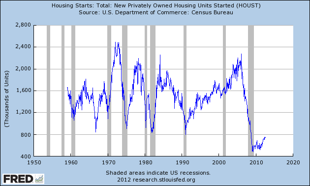
Housing starts (last updated 8-16-12):


-

The Federal Deficit (last updated 2-13-12):


-

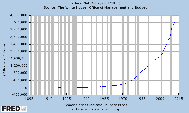
Federal Net Outlays (last updated 2-13-12):


-

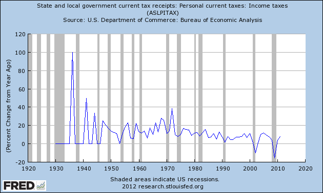
State & Local Personal Income Tax Receipts  (% Change from Year Ago)(last updated 7-27-12):


-

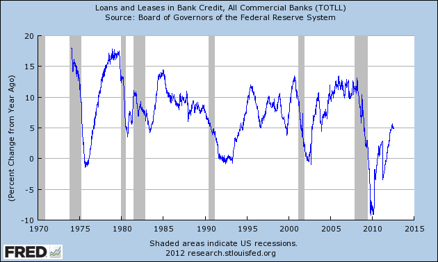
Total Loans and Leases of Commercial Banks (% Change from Year Ago)(last updated 8-13-12):


-

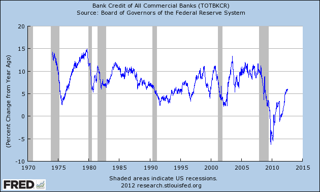
Bank Credit – All Commercial Banks (% Change from Year Ago)(last updated 8-13-12):


-

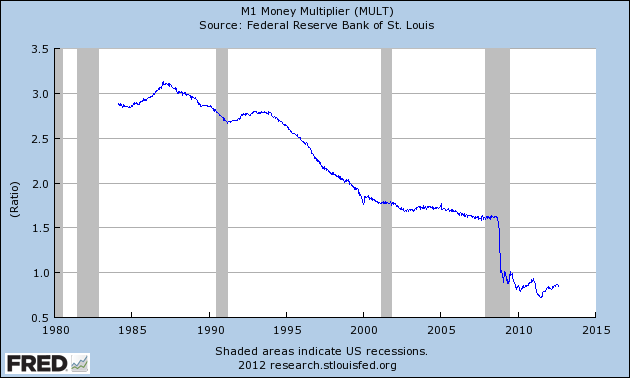
M1 Money Multiplier (last updated 8-16-12):


-

Median Duration of Unemployment (last updated 8-3-12):


-

This next chart is from the CalculatedRisk.com blog post of 8-3-12, titled “July Unemployment Report:  163,000 Jobs, 8.3% Unemployment Rate" and it shows (in red) the relative length and depth of this downturn and subsequent recovery from an employment perspective:


-

This last chart is of the Chicago Fed National Activity Index (CFNAI) and it depicts broad-based economic activity (last updated 8-20-12):


-

I will continue to update these charts on an intermittent basis as they deserve close monitoring…
_____

The Special Note summarizes my overall thoughts about our economic situation

SPX at 1418.16 as this post is written

Sunday, August 19, 2012

Walmart’s Q2 2013 Results – Comments


I found various notable items in Walmart’s Q2 2013 earnings call transcript (pdf) dated August 16, 2012.  I view Walmart’s results and comments as particularly noteworthy given their retail prominence and focus on low prices.  I have previously commented on their quarterly conference call comments; these previous posts are found under the “paycheck to paycheck” label.

Here are various excerpts that I find most notable:

comments from Mike Duke, page 8:

Walmart U.S. continued its momentum this quarter, with comp sales growth of 2.2 percent. Ticket and traffic were positive, and operating income grew faster than sales. Our Walmart U.S. business now has delivered positive comp sales for four consecutive quarters.

comments from Mike Duke, page 9:

International remains our growth engine, but at a slightly slower pace, and you will hear more from Doug on the details.

comments from Mike Duke, page 10:

On July 2, we marked the 50th anniversary of our company and we're pleased that our mission to save people money so they can live better continues to drive us. The Walmart everyday low price model is as relevant today as it was in 1962.

For today's customers, the paycheck cycle remains pronounced in the United States and in our international markets. Given the continuing economic pressures, we believe that our price leadership and value are growing in importance to customers across income levels.

comments from Jeff Davis, page 12:

Gross profit increased 3.8 percent, which corresponds to an 18 basis point reduction in gross margin, compared to last year. This is primarily due to price investments in Walmart U.S. and key International markets.

comments from Bill Simon, page 16:

As you know, price leadership is at the center of our strategy.

comments from Bill Simon, page 16:
Gross profit dollars were up 3.0 percent year-over-year to $18.6 billion. Similar to last quarter, the gross profit rate was down 20 basis points from last year. As we noted last quarter, you'll continue to see a
decrease in our gross margin rate versus last year as we execute our strategic price investment.

comments from Bill Simon, page 20:

Total grocery inflation moderated slightly from what we reported in the first quarter. In categories with higher inflation, customers continued to trade down.

comments from Bill Simon, page 21:

We're also excited about the return of our holiday layaway program, which will begin in the third quarter. Quite simply, this serves a key need for our customers and we're happy to make it available again.
_____

The Special Note summarizes my overall thoughts about our economic situation

SPX at 1418.16 as this post is written

Saturday, August 18, 2012

Long-Term Charts Of The ECRI WLI & ECRI WLI, Gr. – August 17, 2012 Update


As I stated in my July 12, 2010 post ("ECRI WLI Growth History"):
For a variety of reasons, I am not as enamored with ECRI’s WLI and WLI Growth measures as many are.
However, I do think the measures are important and deserve close monitoring and scrutiny.
The movement of the ECRI WLI and WLI, Gr. is particularly notable at this time, as ECRI publicly announced on September 30, 2011 that the U.S. was “tipping into recession,” and ECRI has reaffirmed that view since, most recently in a Bloomberg interview of July 10 titled “Recession Here” in which Lakshman Achuthan argues that the U.S. is now in a recession.

Other past notable reaffirmations of the September 30, 2011 recession call by ECRI were seen (in chronological order)  on March 15 (“Why Our Recession Call Stands”) as well as various interviews and statements the week of May 6, including:


Wall Street Journal video, May 9: “Free Market Economies Have Business Cycles


Below are three long-term charts, from Doug Short’s blog post of August 17 titled “ECRI Weekly Leading Index Continues to Undermine ECRI's Recession Call.”  These charts are on a weekly basis through the August 17 release, indicating data through August 10.

Here is the ECRI WLI (defined at ECRI’s glossary):

(click on charts to enlarge images)


-

This next chart depicts, on a long-term basis, the Year-over-Year change in the 4-week moving average of the WLI:


-

This last chart depicts, on a long-term basis, the WLI, Gr.:


_________

I post various economic indicators and indices because I believe they should be carefully monitored.  However, as those familiar with this blog are aware, I do not necessarily agree with what they depict or imply.
_____

The Special Note summarizes my overall thoughts about our economic situation

SPX at 1418.16 as this post is written
Friday, August 17, 2012

St. Louis Financial Stress Index – August 16, 2012 Update


On March 28, 2011 I wrote a post ("The STLFSI") about the  STLFSI (St. Louis Fed’s Financial Stress Index) which is supposed to measure stress in the financial system.  For reference purposes, the most recent chart is seen below.  This chart was last updated on August 16, incorporating data from December 31,1993 to August 10, 2012 on a weekly basis.  The August 10, 2012 value is .137 :

(click on chart to enlarge image)


_________

I post various indicators and indices because I believe they should be carefully monitored.  However, as those familiar with this blog are aware, I do not necessarily agree with what they depict or imply.
_____

The Special Note summarizes my overall thoughts about our economic situation

SPX at 1417.10 as this post is written
Thursday, August 16, 2012

Building Financial Danger – August 16, 2012 Update


On October 17, 2011 I wrote a post titled “Danger Signs In The Stock Market, Financial System And Economy.”  This post is a brief 15th update to that post.

My overall analysis indicates a continuing elevated and growing level of danger which contains  many worldwide and U.S.-specific “stresses” of a very complex nature. I have written numerous posts in this blog of some of what I consider both ongoing and recent “negative developments.”  These developments, as well as other highly problematic conditions, have presented a highly perilous economic environment that endangers the overall financial system.

My analysis continues to indicate that there are many reasons for tremendous concern, as seen in almost innumerable fundamental economic, financial-market, and proprietary measures.

Many prominent parties seem to be fixated on the European financial problems.  While I continue to believe that these European problems are gravely serious and disconcertingly intractable, and have broader implications,  my analyses indicate that various exceedingly problematical U.S. economic conditions also continue to exist and many lack recognition or effective remedy.

One aspect of tremendous concern is the existence of various large asset bubbles, a subject of which I have extensively written.  While all of these asset bubbles are wildly pernicious and will have profound adverse future implications, hazards presented by the bond market bubble are especially notable.

Predicting the timing and extent of a stock market crash is always difficult, and the immense complexity of today’s economic situation makes such a prediction even more challenging. With that being said, my analyses indicate that the danger inherent in the financial system has reached a level at which a stock market crash – that would also involve (as seen in 2008) various other markets as well – continues to be at a level at which a near-term crash is of tremendous concern.

(note: the “next crash” has outsized significance and implications, as discussed in the post of January 6, "The Next Crash And Its Significance")

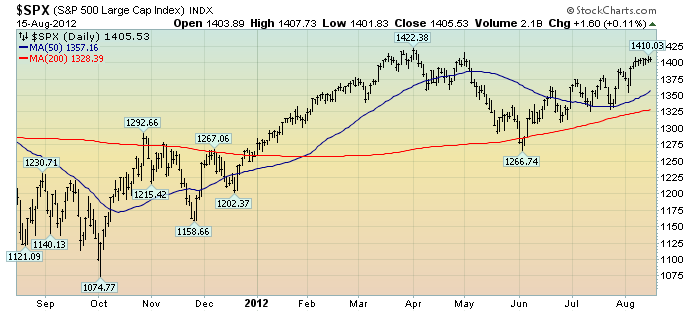
As reference, below is a one-year daily chart of the S&P500, indicating both the 50dma and 200dma as well as price labels.  The current price is 1405.53:

(click on chart to enlarge image)(chart courtesy of StockCharts.com; chart creation and annotation by the author)


_____

The Special Note summarizes my overall thoughts about our economic situation

SPX at 1405.53 as this post is written
Wednesday, August 15, 2012

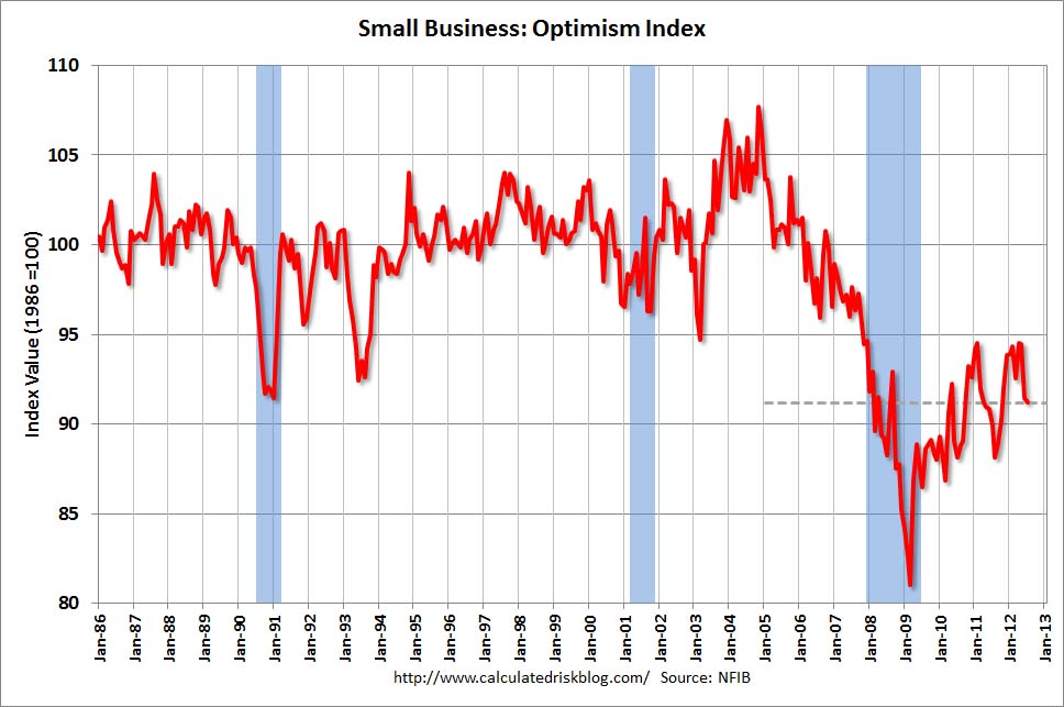
NFIB Small Business Optimism – July 2012


The July NFIB Small Business Optimism report was released on August 14.  The headline of the Press Release is “Small-Business Optimism Continues to Decline in July.”

The Index of Small Business Optimism fell by .2 point in July, to 92.2.

Here are some excerpts from the report that I find particularly notable:
Dipping for a second consecutive month, after ending several months of slow growth, the Small Business Optimism Index gave up 0.2 points, falling to 91.2. The decline, while less anticipated given the Supreme Court decision on the health-care law and a flurry of activity surrounding the fiscal cliff, still leaves owner optimism disturbingly low and at recession levels.
also:
According to July’s report, more owners indicated that they expect business conditions will be worse (and not improved) in six months, and more owners expect real sales volumes to be lower than those who expect them to be higher in three months. This in part explains the lack of any need to hire more workers or to buy new inventory. Job creation plans are historically very low; only five percent of owners think the current period is a good time to expand.
also:
While "poor sales" has been eclipsed by other concerns as the top business problem, it still remains the No.1 issue for 20 percent of owners surveyed.
In conjunction with this July NFIB Small Business Optimism Survey, the CalculatedRisk blog on August 14 (in a post titled "NFIB:  Small Business Optimism declines in July") had a chart that depicted the Index:

(click on charts to enlarge images)


_____

The Special Note summarizes my overall thoughts about our economic situation

SPX at 1402.81 as this post is written
Tuesday, August 14, 2012

Philadelphia Fed – 3rd Quarter 2012 Survey Of Professional Forecasters


The Philadelphia Fed Third Quarter 2012 Survey of Professional Forecasters was released on August 10.  This survey is somewhat unique in various regards, such as it incorporates a longer time frame for various measures.

The survey shows, among many measures, the following expectations:

GDP: (annual average level)
full-year 2012 : 2.2%
full-year 2013 : 2.1%
full-year 2014 : 2.7%
full-year 2015:  3.1%

Unemployment Rate: (annual average level)
for 2012: 8.2%
for 2013: 7.9%
for 2014: 7.3%
for 2015: 7.0%

-

As for “the chance of a contraction in real GDP in any of the next four quarters,” estimates range from 13.8-21.2% for each of the quarters through Q3 2013.

As well, there are also a variety of time frames shown (present through the year 2021) with the expected inflation of each.  Inflation is measured in Headline and Core CPI and Headline and Core PCE.  Over all time frames expectations are shown to be in the 1.5-2.48% range.
_____

I post various economic forecasts because I believe they should be carefully monitored.  However, as those familiar with this blog are aware, I do not agree with many of the consensus estimates and much of the commentary in these forecast surveys.
_____

The Special Note summarizes my overall thoughts about our economic situation

SPX at 1404.11 as this post is written