As I have commented previously, as in the October 6, 2009 post (“A Note About Unemployment Statistics”), in my opinion the official methodologies used to measure the various job loss and unemployment statistics do not provide an accurate depiction; they serve to understate the severity of unemployment.
However, even if one chooses to look at the official statistics, the following charts provide an interesting (and disconcerting) long-term perspective of certain aspects of the officially-stated unemployment situation.
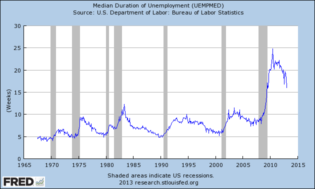
The first two charts are from the St. Louis Fed site. Here is the Median Duration of Unemployment (current value = 16.0 weeks) :
(click on charts to enlarge images)(charts updated as of 2-1-13)
-
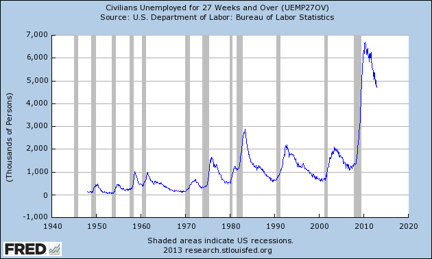
Here is the chart for Unemployed 27 Weeks and Over (current value = 4.708 million) :
-
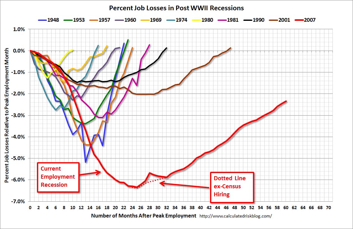
Lastly, a chart from the CalculatedRisk.com site, from the February 1 post titled “January Employment Report: 157,000 Jobs, 7.9% Unemployment Rate.” This shows the employment situation vs. that of previous recessions, as shown:
-
As depicted by these charts, our unemployment problem is severe. Unfortunately, there do not appear to be any “easy” solutions.
On April 24, 2012 I wrote a five-part blog post titled “The Unemployment Situation Facing The United States”, which discusses various problematical issues concerning the present and future employment situation.
_____
The Special Note summarizes my overall thoughts about our economic situation
SPX at 1513.17 as this post is written


No comments:
Post a Comment