Below are those two charts, updated through the latest daily closing price.
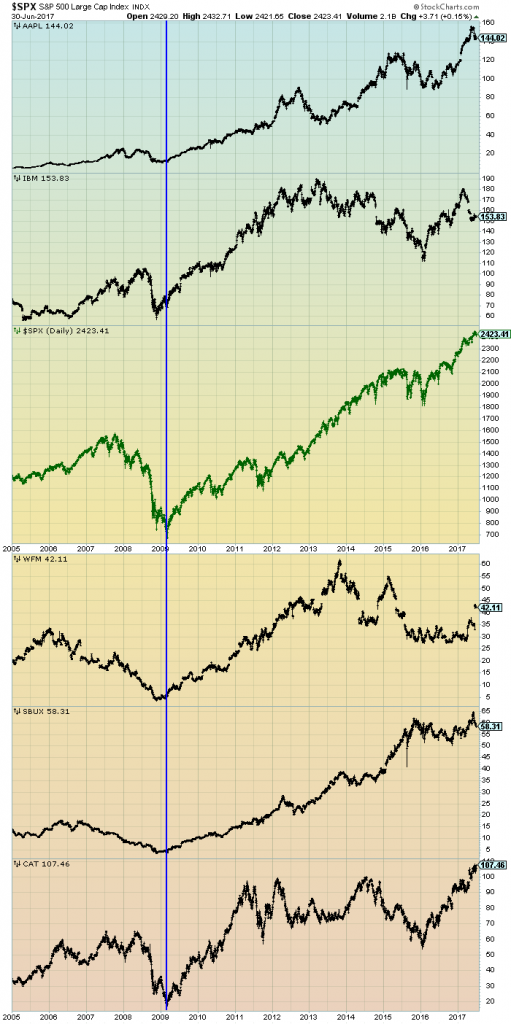
The first is a daily chart of the S&P500 (shown in green), as well as five prominent (AAPL, IBM, WFM, SBUX, CAT) individual stocks, since 2005. There is a blue vertical line that is very close to the March 6, 2009 low. As one can see, both the S&P500 performance, as well as many stocks including the five shown, have performed strongly since the March 6, 2009 low:
(click on chart to enlarge image)(chart courtesy of StockCharts.com; chart creation and annotation by the author)
–
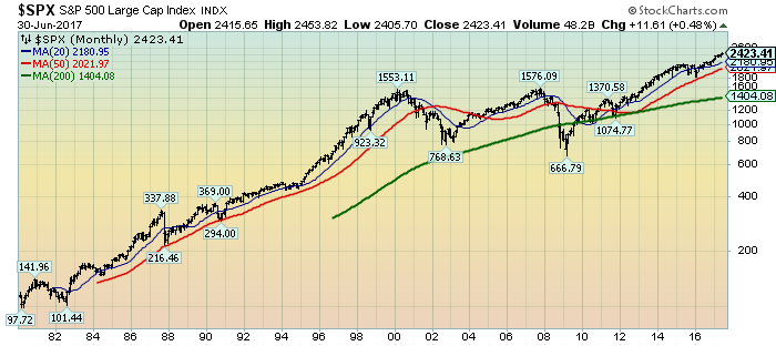
This next chart shows, on a monthly LOG basis, the S&P500 since 1980. I find this chart notable as it provides an interesting long-term perspective on the S&P500′s performance. The 20, 50, and 200-month moving averages are shown in blue, red, and green lines, respectively:
(click on chart to enlarge image)(chart courtesy of StockCharts.com; chart creation and annotation by the author)
_____
The Special Note summarizes my overall thoughts about our economic situation
SPX at 2423.41 as this post is written
No comments:
Post a Comment