The following three charts illustrate various technical analysis aspects of the U.S. Dollar, as depicted by the U.S. Dollar Index.
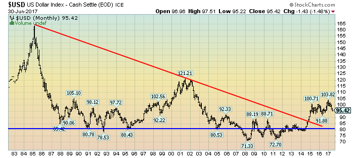
First, a look at the monthly U.S. Dollar from 1983. This clearly shows a long-term weakness, with the blue line showing technical support until 2007, and the red line representing a (past) trendline:
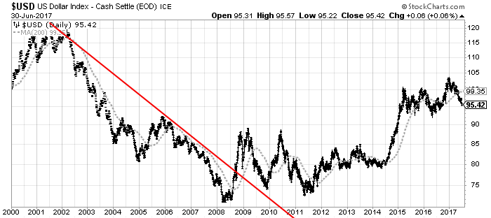
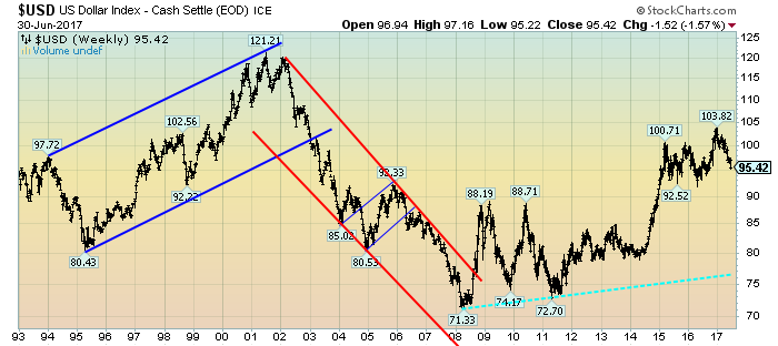
(charts courtesy of StockCharts.com; annotations by the author)
(click on charts to enlarge images)
–
Next, another chart, this one focused on the daily U.S. Dollar since 2000 on a LOG scale. The red line represents a (past) trendline. The gray dotted line is the 200-day M.A. (moving average):
–
Lastly, a chart of the Dollar on a weekly LOG scale. There are two clearly marked past channels, with possible technical support depicted by the dashed light blue line:
–
I will continue providing updates on this U.S. Dollar situation regularly as it deserves very close monitoring…
_____
The Special Note summarizes my overall thoughts about our economic situation
SPX at 2423.41 as this post is written
No comments:
Post a Comment