Wednesday, March 14, 2012

March 13 Gallup Poll On Economic Confidence – Notable Excerpts


On March 13, Gallup released a poll titled “U.S. Economic Confidence Matches Best in Four Years.”

A few notable excerpts:
U.S. economic confidence improved sharply to -18 in the week ending March 11 from -25 the prior week -- the highest since the week ending Feb. 13, 2011, when it was also -18. The -18 readings this year and last are the highest weekly levels Gallup has recorded since it started tracking confidence daily in January 2008.
also:
The percentage of Americans saying the economy is "getting better" increased to 43% last week, while the percentage saying it is "getting worse" fell to 53%. Both of these measures are at their best levels since the 43% "getting better" and 52% "getting worse" of the week ending Feb. 13, 2011.
In a separate question, consumers' "poor" rating of the economy is now at 39%. This is the lowest "poor" rating for current economic conditions since the week ending March 9, 2008.
also:
This improvement in consumer perceptions is taking place despite sharply higher gas prices at the pump. In this regard, Gallup data find gas prices would need to climb to more than $5 per gallon before consumers would need to significantly alter their lifestyles.
_____

The Special Note summarizes my overall thoughts about our economic situation

SPX at 1397.52 as this post is written

Tuesday, March 13, 2012

The Level Of The VIX And The VIX Futures


In the February 7 ("The VIX Level Of 20 And Its Continual Significance") as well as the February 6 ("Notable Technical And Sentiment Extremes In The Stock Market") posts I discussed various notable aspects of the stock market, ones that I viewed as problematic and worrisome.

In this post, I would like to provide an update on two of those aspects.  First, at yesterday's close, the VIX was at 15.64.  As I discussed in the aforementioned February 7 post:
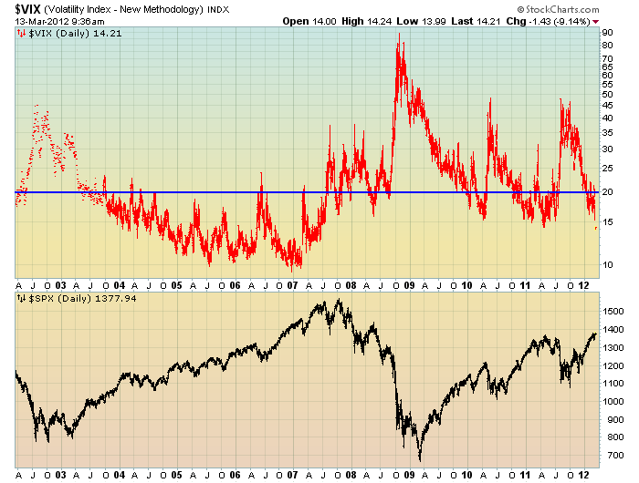
In addition, when one views the VIX compared to the stock market (S&P500) over the last few years, one might conclude that a VIX level under 20 signifies investor overconfidence and/or complacency, as the stock market has often reacted in a sharply negative manner after sustained VIX advances above the 20 level.
Below is a chart displaying the VIX, in red, on a LOG scale, 10-year daily basis through this morning's current level of 14.21.  Below the VIX is the S&P500 :

(click on chart to enlarge image)(chart courtesy of StockCharts.com; chart creation and annotation by the author)


-

In addition, the price levels of the VIX vs. the VIX futures is highly notable.  I discussed this aspect in the aforementioned February 6 post.

At this moment, with the S&P500 at 1378.11, the VIX is at 14.32, while some VIX futures are at the following levels:

March VIX futures = 17.40
April VIX futures= 21.55
May VIX futures = 23.60
June VIX futures =24.85
August futures = 26.95
September futures =27.70

I view this spread as being highly outsized and is one of many “red flags” in the market.
_____

The Special Note summarizes my overall thoughts about our economic situation

SPX at 1378.11 as this post is written

Monday, March 12, 2012

Long-Term Charts Of The ECRI WLI & ECRI WLI, Gr. – March 9, 2012 Update


As I stated in my July 12, 2010 post ("ECRI WLI Growth History"):
For a variety of reasons, I am not as enamored with ECRI’s WLI and WLI Growth measures as many are.
However, I do think the measures are important and deserve close monitoring and scrutiny.
The movement of the ECRI WLI and WLI, Gr. is particularly notable at this time, as ECRI publicly announced on September 30 that the U.S. was “tipping into recession,” and have reaffirmed that view recently, such as on February 24.  I featured excerpts from their September 30 statement  in the October 3 post ("ECRI Recession Statement Of September 30 – Notable Excerpts")

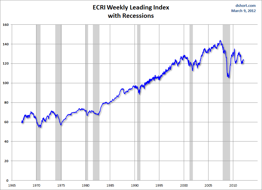
Below is a long-term chart, on a weekly basis through March 9, of the ECRI WLI (defined at ECRI’s glossary) from Doug Short’s blog post of March 9 titled “ECRI's Weekly Leading Index Improves (Slightly) Yet Again” :

(click on charts to enlarge images)


-

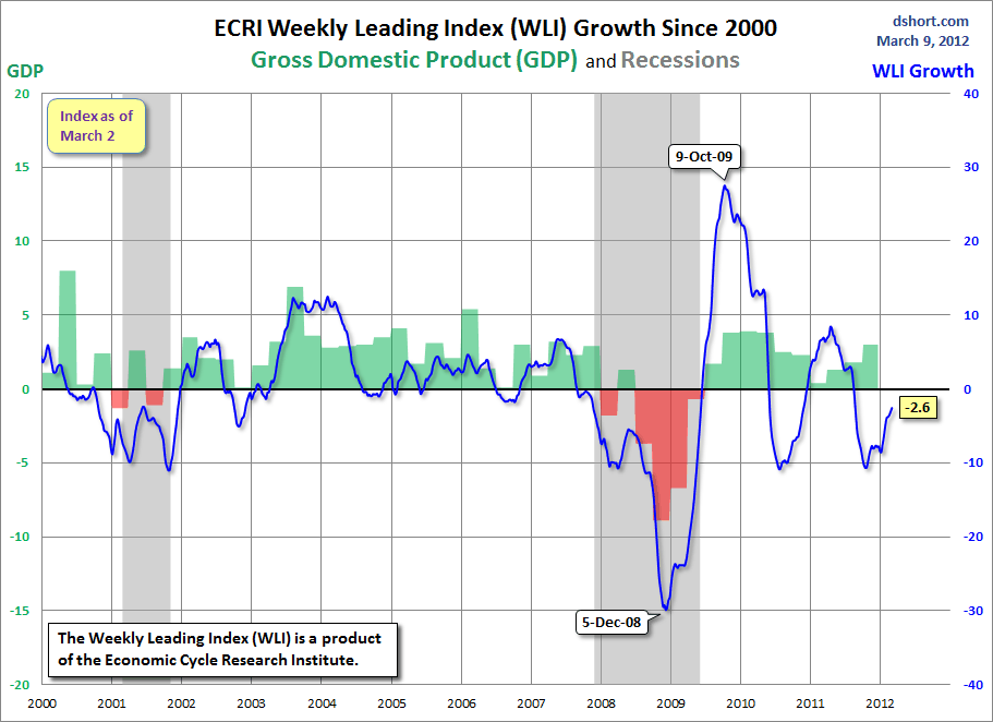
This next chart depicts, on a long-term basis, the WLI, Gr. through March 9:


_________

I post various indicators and indices because I believe they should be carefully monitored.  However, as those familiar with this blog are aware, I do not necessarily agree with what they depict or imply.

_____

The Special Note summarizes my overall thoughts about our economic situation

SPX at 1370.87 as this post is written

Sunday, March 11, 2012

Total Household Net Worth As Of 4Q 2011 – A Long-Term Chart


In the March 8 post ("Total Household Net Worth As A Percent Of GDP 4Q 2011") I displayed a long-term chart depicting Total Household Net Worth as a percentage of GDP.

For reference purposes, here is Total Household Net Worth from a long-term perspective (from 1949:Q4 to 2011:Q4).  The last value (as of March 9, 2012) is $58.455 Trillion:

(click on each chart to enlarge image)

_____

The Special Note summarizes my overall thoughts about our economic situation

SPX at 1370.87 as this post is written

U-3 And U-6 Unemployment Rate Long-Term Reference Charts As Of March 9, 2012


Shortly after each monthly employment report I have been posting a continual series titled “3 Critical Unemployment Charts.”

Of course, there are many other employment charts that can be displayed as well.

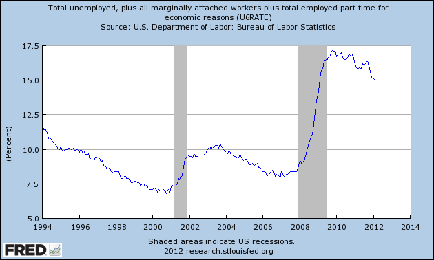
For reference purposes, below are the U-3 and U-6 Unemployment Rate charts from a long-term historical perspective.  Both charts are from the St. Louis Fed site.  The U-3 measure is what is commonly referred to as the official unemployment rate; whereas the U-6 rate is officially (per Bureau of Labor Statistics) defined as:
Total unemployed, plus all persons marginally attached to the labor force, plus total employed part time for economic reasons, as a percent of the civilian labor force plus all persons marginally attached to the labor force
Of note, many economic observers use the U-6 rate as a (closer) proxy of the actual unemployment rate rather than that depicted by the U-3 measure.

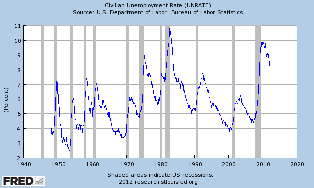
Here is the U-3 chart, currently showing a 8.3% unemployment rate:

(click on charts to enlarge images)(charts updated as of 3-9-12)


-

Here is the U-6 chart, currently showing a 14.9% unemployment rate:

_____

The Special Note summarizes my overall thoughts about our economic situation

SPX at 1370.87 as this post is written

3 Critical Unemployment Charts – March 2012


As I have commented previously, as in the October 6, 2009 post (“A Note About Unemployment Statistics”), in my opinion the official methodologies used to measure the various job loss and unemployment statistics do not provide an accurate depiction; they serve to understate the severity of unemployment.

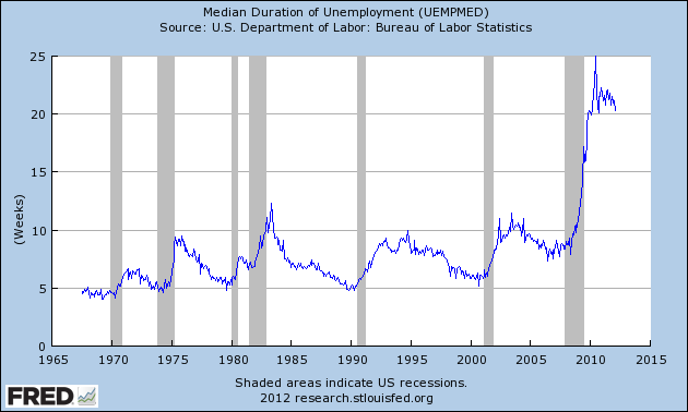
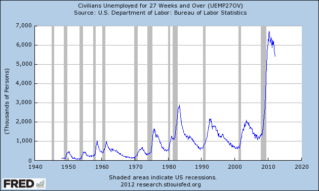
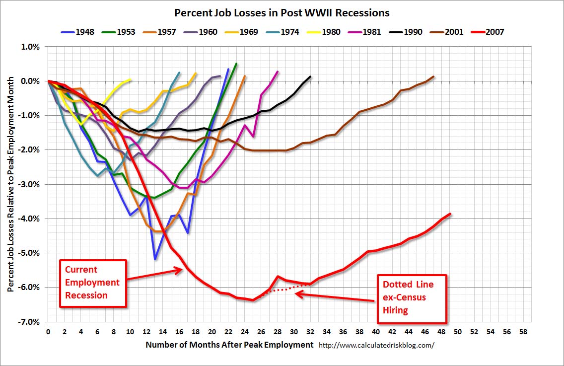
However, even if one chooses to look at the official statistics, the following charts provide an interesting (and disconcerting) long-term perspective of certain aspects of the officially-stated unemployment situation.

The first two charts are from the St. Louis Fed site.  Here is the Median Duration of Unemployment (current value = 20.3 weeks) :

(click on charts to enlarge images)(charts updated as of 3-9-12)


-

Here is the chart for Unemployed 27 Weeks and Over (current value =  5.426 million) :


-

Lastly, a chart from the CalculatedRisk.com site, from the March 9 post titled “February Employment Report:  227,000 Jobs, 8.3% Unemployment Rate.”  This shows the employment situation vs. that of previous recessions, as shown:


-

As depicted by these charts, our unemployment problem is severe.  Unfortunately, there do not appear to be any “easy” solutions.

In July 2009 I wrote a series of five blog posts titled “Why Aren’t Companies Hiring?”, which discusses various aspects of the topic, many of which lack recognition.
_____

The Special Note summarizes my overall thoughts about our economic situation

SPX at 1370.87 as this post is written

Friday, March 9, 2012

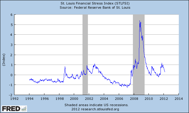
St. Louis Financial Stress Index – March 8, 2012 Update


On March 28, 2011 I wrote a post ("The STLFSI") about the  STLFSI (St. Louis Fed’s Financial Stress Index) which is supposed to measure stress in the financial system.  For reference purposes, the most recent chart is seen below.  This chart was last updated on March 8, incorporating data from 12-31-93 to 3-2-12 on a weekly basis.  The present level is .278 :

_________

I post various indicators and indices because I believe they should be carefully monitored.  However, as those familiar with this blog are aware, I do not necessarily agree with what they depict or imply.
_____

The Special Note summarizes my overall thoughts about our economic situation

SPX at 1365.91 as this post is written

Charts of Equities' Performance Since March 9, 2009 And January 1, 1980


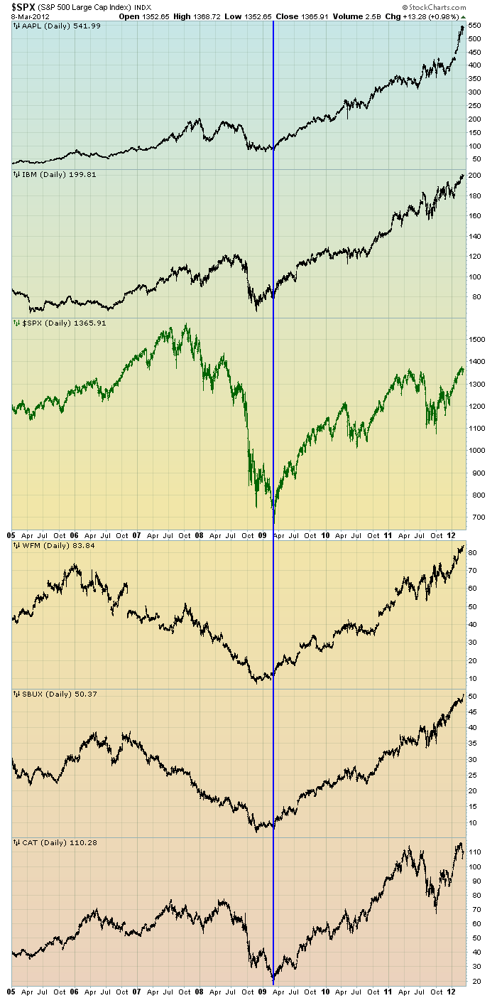
Three years ago today the S&P500 made its daily low close of 676.53.  (It made the ultimate intraday low of 666.79 on the prior trading day, March 6, 2009).   Many, including myself, consider March 9, 2009 as the start of this stock market advance.

There are two charts I would like to highlight as reference; I may further comment on them at a later date.

The first is a daily chart of the S&P500 (shown in green), as well as five (AAPL, IBM, WFM, SBUX, CAT) individual stocks, since 2005.  There is a blue vertical line that is very close to the March 6, 2009 low.  As one can see, both the S&P500 performance, as well as many stocks including the five shown, has been strong since the March 6, 2009 low:

(click on chart to enlarge image)(chart courtesy of StockCharts.com; chart creation and annotation by the author)


-

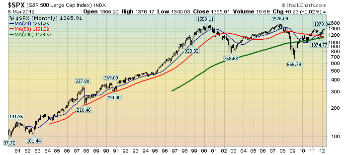
This next chart shows, on a monthly LOG basis, the S&P500 since 1980.  I find this chart notable as it provides an interesting long-term perspective on the S&P500's performance.  The 20, 50, and 200-month moving averages are shown in blue, red, and green lines, respectively:

(click on chart to enlarge image)(chart courtesy of StockCharts.com; chart creation and annotation by the author) 

_____

The Special Note summarizes my overall thoughts about our economic situation

SPX at 1365.91 as this post is written