Friday, July 5, 2013

Long-Term Charts Of The ECRI WLI & ECRI WLI, Gr. – July 5, 2013 Update

As I stated in my July 12, 2010 post ("ECRI WLI Growth History"):
For a variety of reasons, I am not as enamored with ECRI’s WLI and WLI Growth measures as many are.
However, I do think the measures are important and deserve close monitoring and scrutiny.
The movement of the ECRI WLI and WLI, Gr. is particularly notable at this time, as ECRI publicly announced on September 30, 2011 that the U.S. was “tipping into recession,” and ECRI has reiterated the view that the U.S. economy is currently in a recession, seen most recently in these five sources :
Other past notable 2012 reaffirmations of the September 30, 2011 recession call by ECRI were seen (in chronological order)  on March 15 (“Why Our Recession Call Stands”) as well as various interviews and statements the week of May 6, including:
Also, subsequent to May 2012:
-

Below are three long-term charts, from Doug Short’s blog post of July 5 titled “ECRI Recession Watch:  Weekly Update”  These charts are on a weekly basis through the July 5 release, indicating data through June 28, 2013.

Here is the ECRI WLI (defined at ECRI’s glossary):

(click on charts to enlarge images)

Dshort 7-5-13 ECRI-WLI 130.4

-

This next chart depicts, on a long-term basis, the Year-over-Year change in the 4-week moving average of the WLI:

Dshort 7-5-13 ECRI-WLI-YoY 7.5 percent

-

This last chart depicts, on a long-term basis, the WLI, Gr.:

Dshort 7-5-13 ECRI-WLI-growth-since-1965 5.3

_________

I post various economic indicators and indices because I believe they should be carefully monitored.  However, as those familiar with this blog are aware, I do not necessarily agree with what they depict or imply.
_____

The Special Note summarizes my overall thoughts about our economic situation

SPX at 1629.18 as this post is written

St. Louis Financial Stress Index – July 3, 2013 Update

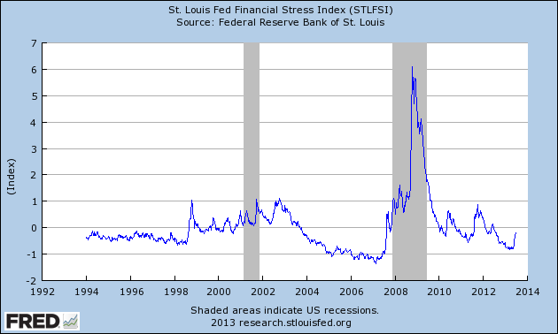
On March 28, 2011 I wrote a post ("The STLFSI") about the  St. Louis Fed’s Financial Stress Index (STLFSI) which is supposed to measure stress in the financial system.  For reference purposes, the most recent chart is seen below.  This chart was last updated on July 3, incorporating data from December 31,1993 to June 28, 2013, on a weekly basis.  The June 28, 2013 value is -.201:

(click on chart to enlarge image)

STLFSI_7-3-13 -.201

-

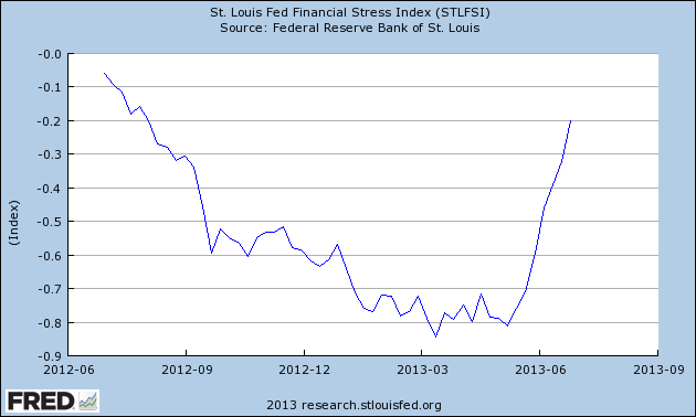
Here is the STLFSI chart from a 1-year perspective:

STLFSI_7-3-13 -.201 1-year
Data Source: FRED, Federal Reserve Economic Data, Federal Reserve Bank of St. Louis; accessed July 5, 2013:

_________

I post various indicators and indices because I believe they should be carefully monitored.  However, as those familiar with this blog are aware, I do not necessarily agree with what they depict or imply.
_____

The Special Note summarizes my overall thoughts about our economic situation

SPX at 1615.41 as this post is written
Deflation Probabilities

While I do not agree with the current readings of the measure – I think the measure dramatically understates the probability of deflation, as measured by the CPI – the Federal Reserve Bank of Atlanta maintains an interesting data series titled “Deflation Probabilities.”

As stated on the site:
Using estimates derived from Treasury Inflation-Protected Securities (TIPS) markets, described in a technical appendix, this weekly report provides two measures of the probability of consumer price index (CPI) deflation through 2018.
A chart shows the trends of the probabilities.  As one can see in the chart, the readings are volatile.

As for the current weekly reading, the July 3 update states the following:
The 2013–18 deflation probability, based on the 5-year TIPS issued in April and the 10-year TIPS issued in July 2008, was 12 percent on July 2, down from 13 percent on June 25. The 2012–17 deflation probability ticked down from 8 percent on June 25 to 6 percent on July 2.
Prices of Treasury Inflation-Protected Securities (TIPS) with similar maturity dates can be used to measure probabilities of a net decline in the consumer price index over the five-year period starting in early 2013 or the five-year period starting in early 2012.
I plan on providing updates to this measure on a regular interval.
_________

I post various economic indicators and indices because I believe they should be carefully monitored.  However, as those familiar with this blog are aware, I do not necessarily agree with what they depict or imply.
_____

The Special Note summarizes my overall thoughts about our economic situation

SPX at 1615.41 this post is written

Recession Probability Models

There are a variety of economic models that are supposed to predict the probabilities of recession.

While I don’t agree with the methodologies employed or probabilities of impending economic weakness as depicted by the following two models, I think the results of these models should be monitored.

Please note that each of these models is updated regularly, and the results of these – as well as other recession models – can fluctuate significantly.

The first is the “Yield Curve as a Leading Indicator” from the New York Federal Reserve.  I wrote a blog post concerning this measure on March 1, 2010, titled “The Yield Curve as a Leading Indicator.”

Currently (last updated July 2, using data through June) this “Yield Curve” model shows a 2.52% probability of a recession in the United States twelve months ahead.  For comparison purposes, it showed a 4.19% probability through May.

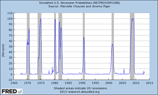
The second model is from Marcelle Chauvet and Jeremy Piger.  This model is described on the St. Louis Federal Reserve site (FRED) as follows:
Smoothed recession probabilities for the United States are obtained from a dynamic-factor markov-switching model applied to four monthly coincident variables: non-farm payroll employment, the index of industrial production, real personal income excluding transfer payments, and real manufacturing and trade sales. This model was originally developed in Chauvet, M., “An Economic Characterization of Business Cycle Dynamics with Factor Structure and Regime Switching,” International Economic Review, 1998, 39, 969-996. (http://faculty.ucr.edu/~chauvet/ier.pdf)
Additional details and explanations can be seen on the “U.S. Recession Probabilities” page.

This model, last updated on July 1, 2013, currently shows a 3.08% probability using data through April.

Here is the FRED chart (last updated July 1) :

RECPROUSM156N_7-1-13 3.08 percent
Data Source: FRED, Federal Reserve Economic Data, Federal Reserve Bank of St. Louis: Marcelle Chauvet and Jeremy Piger; U.S. Recession Probabilities [RECPROUSM156N]; accessed July 5, 2013:

-

The two models featured above can be compared against measures seen in recent blog posts.  For instance, as seen in the June 17 post titled "The June 2013 Wall Street Journal Economic Forecast Survey" economists surveyed averaged a 15% probability of a U.S. recession within the next 12 months.

Of course, there is a (very) limited number of prominent parties, such as ECRI (most recently featured in the June 28 post titled "Long-Term Charts Of The ECRI WLI & ECRI WLI,Gr. – June 28, 2013 Update") that believe the U.S. is currently experiencing a recession.
_____

The Special Note summarizes my overall thoughts about our economic situation

SPX at 1615.41 as this post is written
Wednesday, July 3, 2013

July 2 Gallup Poll Results On Economic Confidence – Notable Excerpts

On July 2, Gallup released the poll results titled “U.S. Economic Confidence Holds Near Five-Year High in June.”  The subtitle is “Gallup's Economic Confidence Index is -8 for June, similar to -7 in May.”

Notable excerpts include:
Americans' confidence in the economy held steady in June, despite U.S. stock prices registering a monthly decline for the first time this year. Gallup's Economic Confidence Index averaged -8 in June, on par with -7 in May -- the highest monthly score since Gallup began tracking economic confidence daily in January 2008.
also:
The stronger May and June ratings pushed the average confidence score for the second quarter of 2013 to -9, the third consecutive quarter the index has improved. The -9 second quarter score is also the best Gallup has measured for any quarter to date since it began daily tracking of confidence in 2008.
also:
Americans' net economic outlook was -3 in June, similar to the -1 recorded in May -- the highest monthly economic outlook score in more than five years. The current score is based on 46% of Americans saying the economy is getting better and 49% saying it is getting worse.
Americans' assessments of current economic conditions were essentially unchanged in June, at -12. The score reflects 20% of Americans rating current U.S. economic conditions as excellent or good and 32% saying they are poor.
Here is the accompanying chart depicting monthly economic confidence:
Monthly Economic Confidence Index score

_____

The Special Note summarizes my overall thoughts about our economic situation

SPX at 1611.95 as this post is written
Recession Measures – Updated

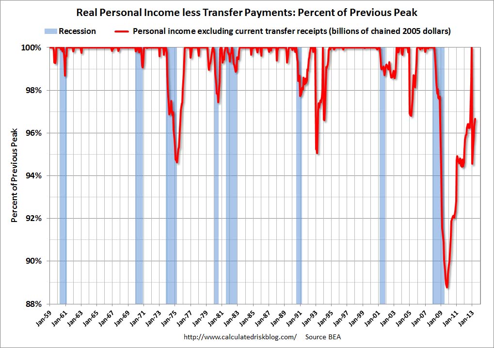
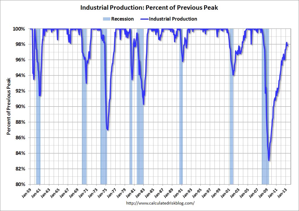
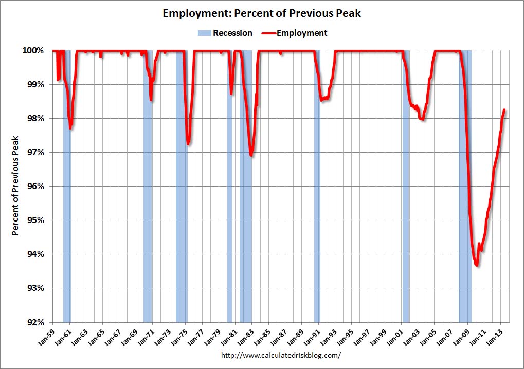
This post is the latest update to a series of blog posts seen on the CalculatedRisk.com blog.  The original blog post of April 12, 2010, is titled “Recession Measures.” In it, Bill discussed key measures that the NBER uses to determine recoveries, and posted four charts.

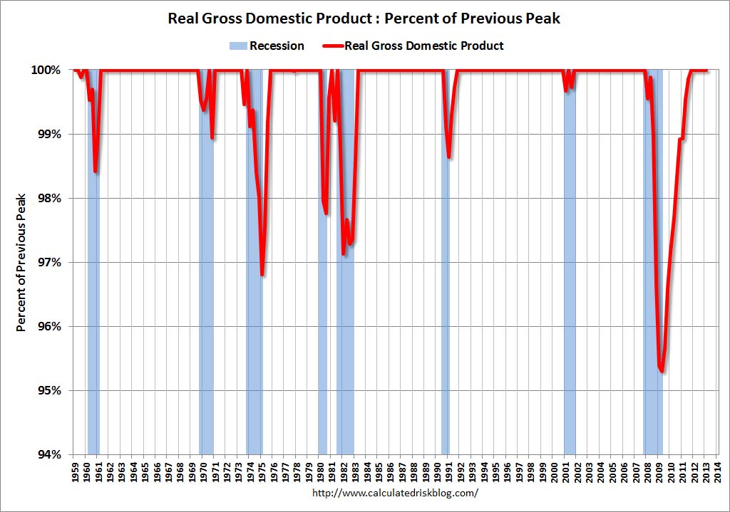
Here are those charts, updated in his July 1, 2013 post titled “Update:  Recovery Measures.”  The charts are constructed in a fashion different than most – in a “percent of peak” fashion.  As defined, “The following graphs are all constructed as a percent of the peak in each indicator.  This shows when the indicator has bottomed – and when the indicator has returned to the level of the previous peak.  If the indicator is at a new peak, the value is 100%.”  Periods of recession, as defined by the NBER, are shown as blue bars.

Here are the four charts, updated through the dates shown:

(click on images to enlarge)

Real Gross Domestic Product, above its pre-recession peak:

CR 7-1-13 RMGDPJuly2013

-

Real Personal Income Less Transfer Payments, now 3.3% below the peak in December:

CR 7-1-13 RMPIlessTransferJuly2013

-

Industrial Production, still 2.1% below the pre-recession peak:

CR 7-1-13 RMIPJuly2013

-

Payroll Employment, still 1.8% below the pre-recession peak:

CR 7-1-13 RMEmployJuly2013

_____

The Special Note summarizes my overall thoughts about our economic situation

SPX at 1609.94 as this post is written
Tuesday, July 2, 2013

Disturbing Charts (Update 11)

I find the following charts to be disturbing.   These charts would be disturbing at any point in the economic cycle; that they (on average) depict such a tenuous situation now – 49 months after the official (as per the 9-20-10 NBER announcement) June 2009 end of the recession – is especially notable.

These charts raise a lot of questions.  As well, they highlight the “atypical” nature of our economic situation from a long-term historical perspective.

All of these charts (except one, as noted) are from the Federal Reserve, and represent the most recently updated data.

The following 8 charts are from the St. Louis Federal Reserve:

(click on charts to enlarge images)

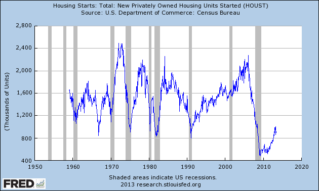
Housing starts (last updated 6-18-13):

EconomicGreenfield 7-2-13 HOUST_6-18-13 914

-

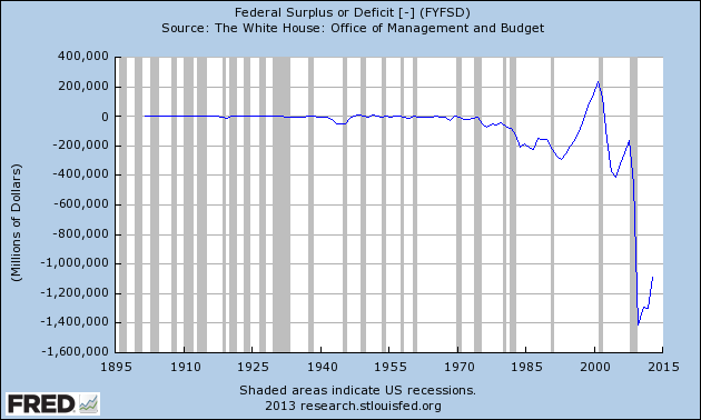
The Federal Deficit (last updated 4-19-13):

EconomicGreenfield 7-2-13 FYFSD_4-19-13 -1086963

-

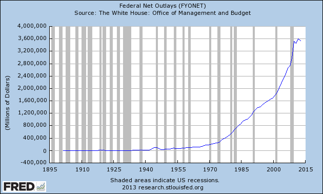
Federal Net Outlays (last updated 4-19-13):

EconomicGreenfield 7-2-13 FYONET_4-19-13 3537127

-

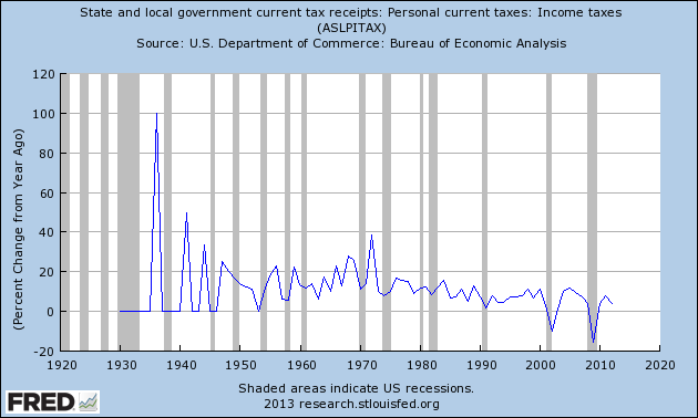
State & Local Personal Income Tax Receipts  (% Change from Year Ago)(last updated 3-28-13):

EconomicGreenfield 7-2-13 ASLPITAX_3-28-13 Percent Change From Year Ago

-

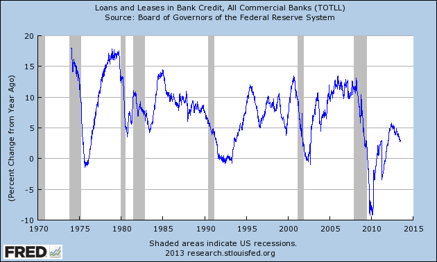
Total Loans and Leases of Commercial Banks (% Change from Year Ago)(last updated 6-28-13):

EconomicGreenfield 7-2-13 TOTLL 6-28-13 Percent Change From Year Ago

-

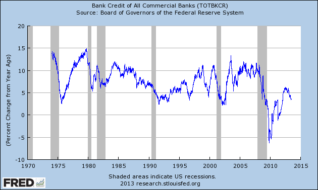
Bank Credit – All Commercial Banks (% Change from Year Ago)(last updated 6-28-13):

EconomicGreenfield 7-2-13 TOTBKCR 6-28-13 Percent Change From Year Ago

-

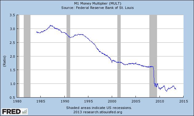
M1 Money Multiplier (last updated 6-20-13):

EconomicGreenfield 7-2-13 MULT 6-20-13 .79

-

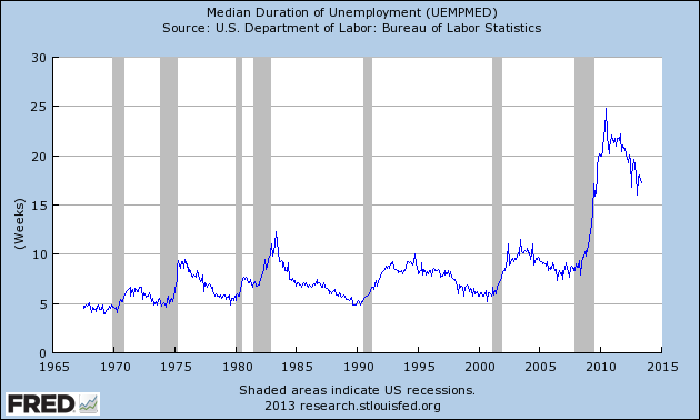
Median Duration of Unemployment (last updated 6-7-13):

EconomicGreenfield 7-2-13 UEMPMED 6-7-13 17.3 weeks

-

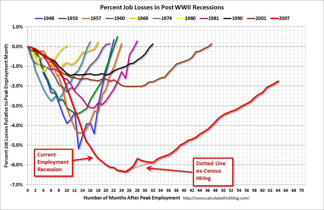
This next chart is from the CalculatedRisk.com blog post of June 7, 2013, titled "May Employment Report:  175,000 Jobs, 7.6% Unemployment Rate" and it shows (in red) the relative length and depth of this downturn and subsequent recovery from an employment perspective:

CR 6-7-13 EmployRecMay2013

-

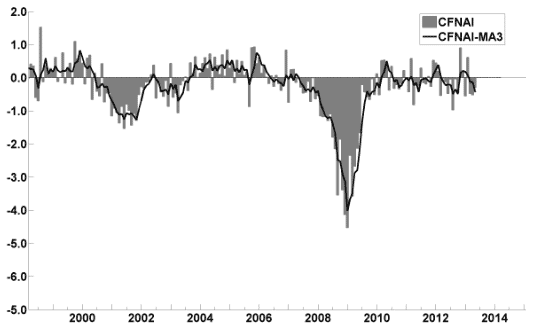
This last chart is of the Chicago Fed National Activity Index (CFNAI, and its 3-month moving average CFNAI-MA3) and it depicts broad-based economic activity (last updated 6-24-13):

cfnai_monthly_MA3 6-24-13

-

I will continue to update these charts on an intermittent basis as they deserve close monitoring…

_____

The Special Note summarizes my overall thoughts about our economic situation

SPX at 1614.96 as this post is written
Monday, July 1, 2013

U.S. Dollar Decline – July 1, 2013 Update

U.S. Dollar weakness is a foremost concern of mine.  As such, I have extensively written about it.  I am very concerned that the actions being taken to “improve” our economic situation will dramatically weaken the Dollar.  Should the Dollar substantially decline from here, as I expect, the negative consequences will far outweigh any benefits.  The negative impact of a substantial Dollar decline can’t be overstated, in my opinion.

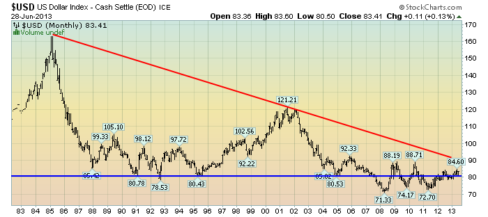
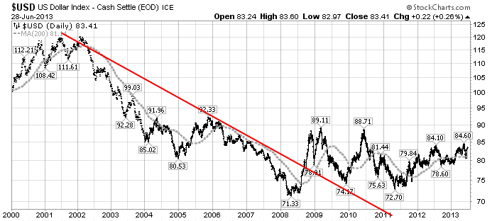
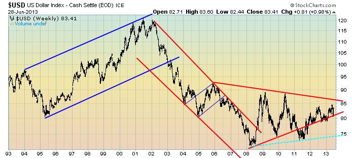
The following three charts illustrate various technical analysis aspects of the U.S. Dollar, as depicted by the U.S. Dollar Index.

First, a look at the monthly U.S. Dollar from 1983.  This clearly shows a long-term weakness, with the blue line showing technical support until 2007:

(charts courtesy of StockCharts.com; annotations by the author)

(click on charts to enlarge images)

EconomicGreenfield 7-1-13 USD Monthly

-

Next, another chart, this one focused on the daily U.S. Dollar since 2000 on a LOG scale.  The red line represents both a (past) trendline as well as a relatively good visual “best-fit” line.  The gray dotted line is the 200-day M.A. (moving average):

EconomicGreenfield 7-1-13 USD 200dma

-

Lastly, a chart of the Dollar on a weekly LOG scale.  There are some clearly marked  channels, with a potential large, prominent triangle featured (shown with two potential lower trendlines, one red and one dashed light blue line):

EconomicGreenfield 7-1-13 USD Weekly Triangle

-

I will continue providing updates on this U.S. Dollar situation regularly as it deserves very close monitoring…
_____

The Special Note summarizes my overall thoughts about our economic situation

SPX at 1606.28 as this post is written